About the Project
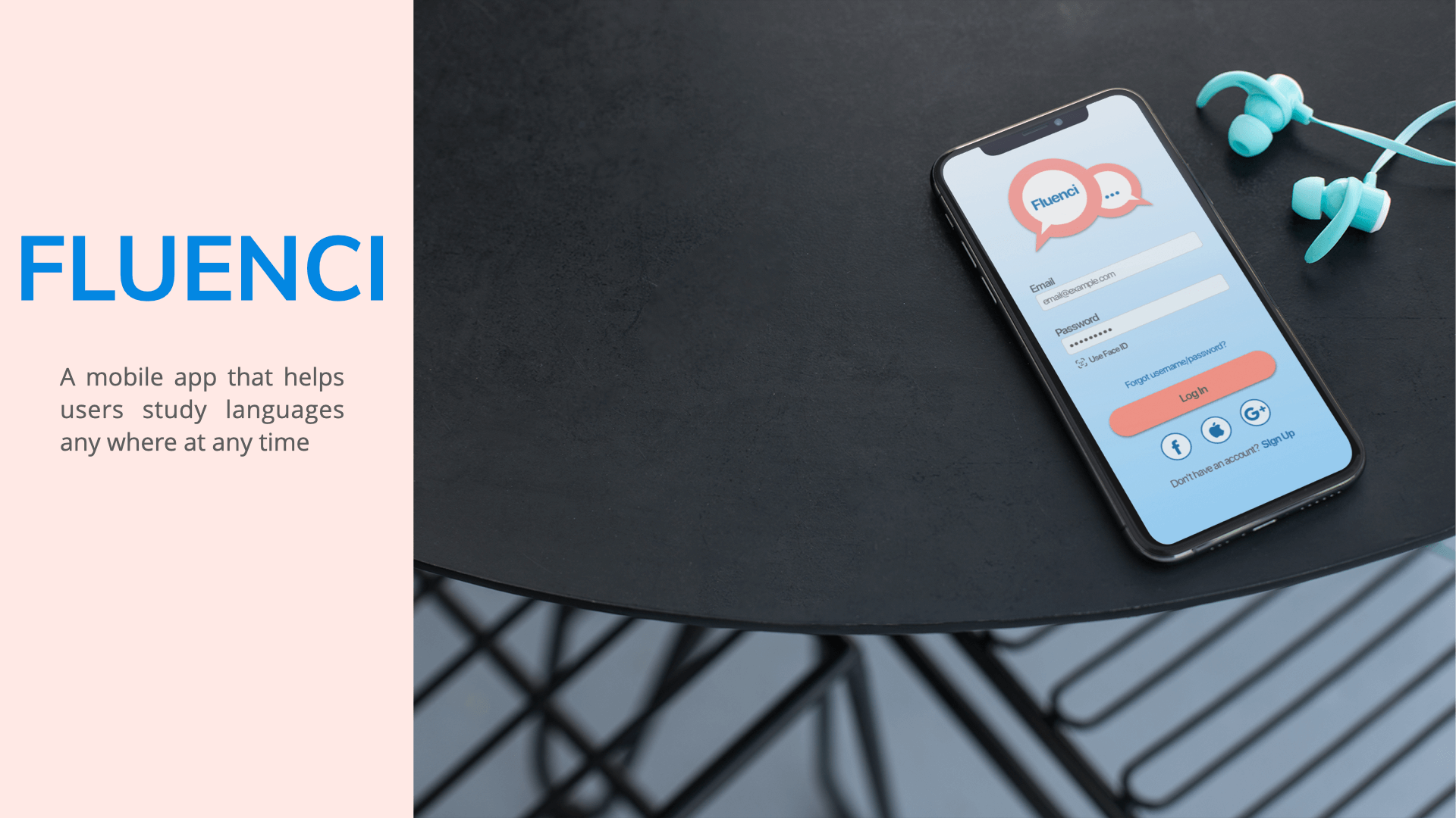
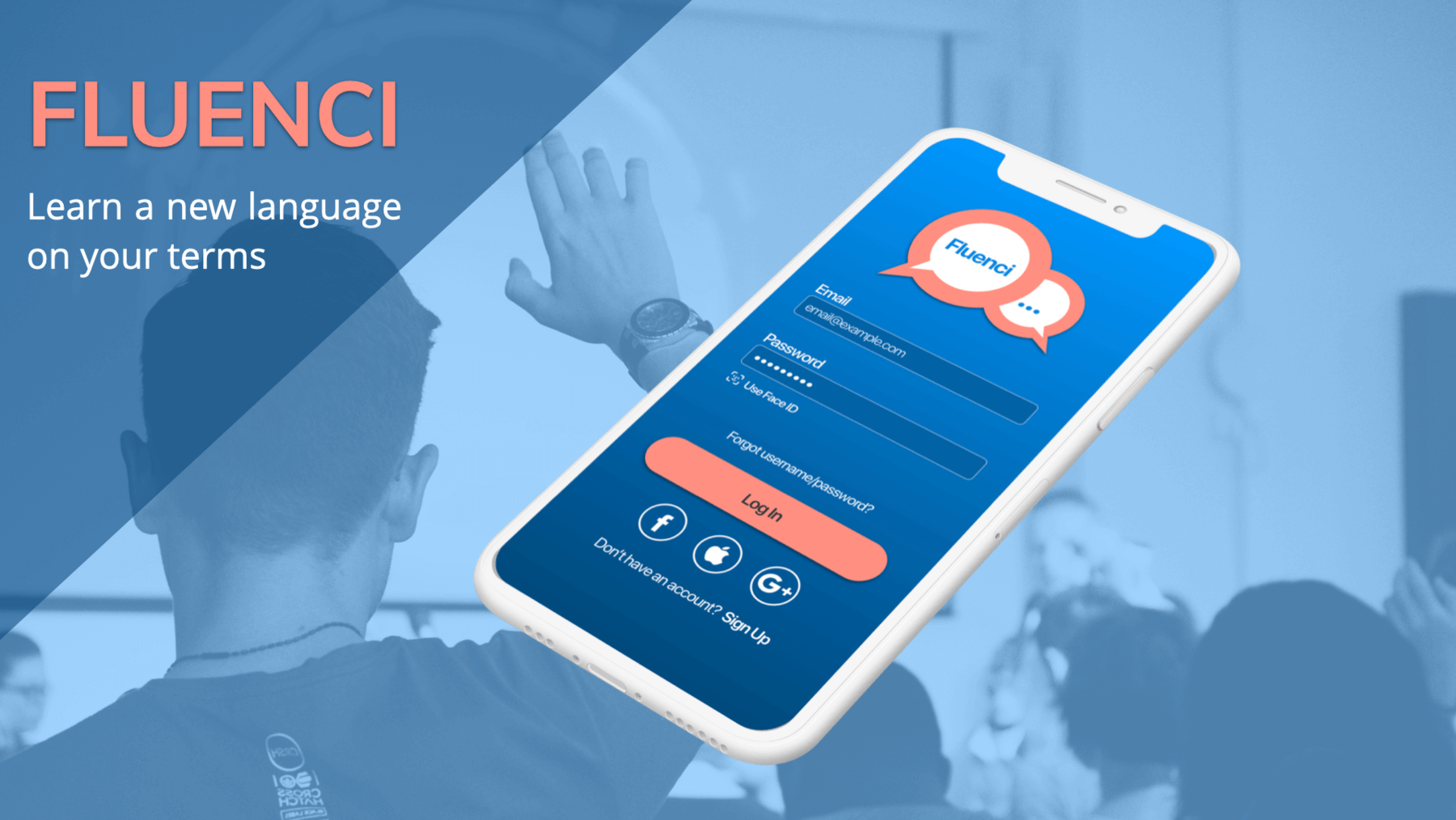
Fluenci is a prototype app designed for users to practice languages whenever and wherever it works for them. Goal setting and benchmarks help users stay on track. Multi-media formats, including flashcards, messaging, audio and video help support learning in a number of ways. Quizzes help users test their skills and track progress. Users need a way to practice language skills that allows for goal setting and flexibility, because they need motivation to stay on track and have busy schedules. I was responsible for UX design including:
Tools used: paper & pencil, Lucid Chart, Prott, Sketch, Invision
Competitive Research
We looked at three vocabulary and language study apps to better understand the competition.
Brainscape
Key Takeaways:
- Option to create custom content
- Clear benchmarks for tracking progress
- There’s no option to take quizzes or tests to gauge progress
StudyBlue
Key Takeaways:
- Lots of customization options
- Navigation is tricky, app lacks visual hierarchy
- Some features and content are redundant
Memrise

Key Takeaways:
- Multimedia practice - text, audio and video
- Explore feature translates what your camera can see
- Few benchmarks for tracking progress
Proto-Persona
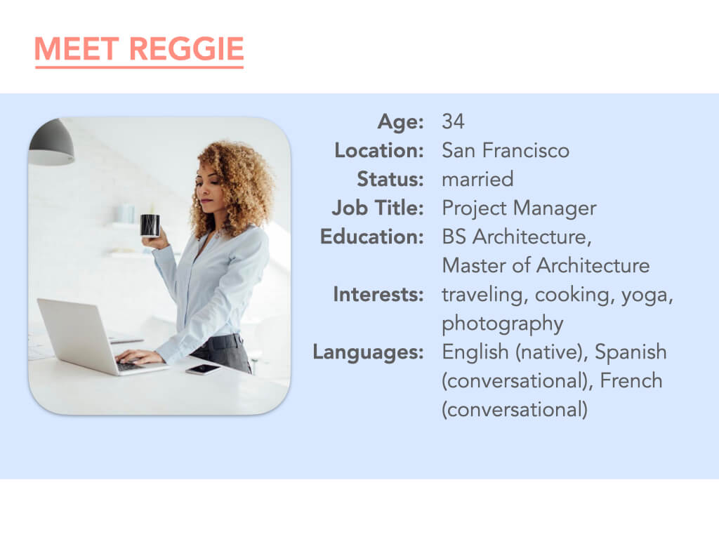
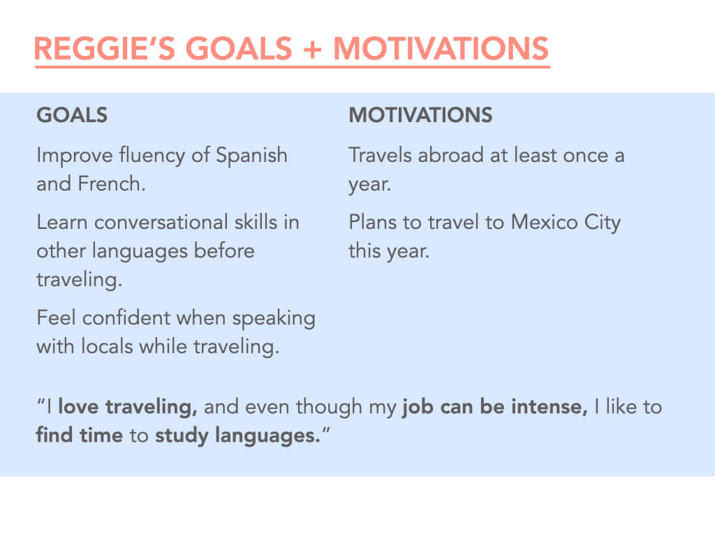
We used our competitive analysis and user research to develop our persona, Reggie, a young, busy professional.
User Flows
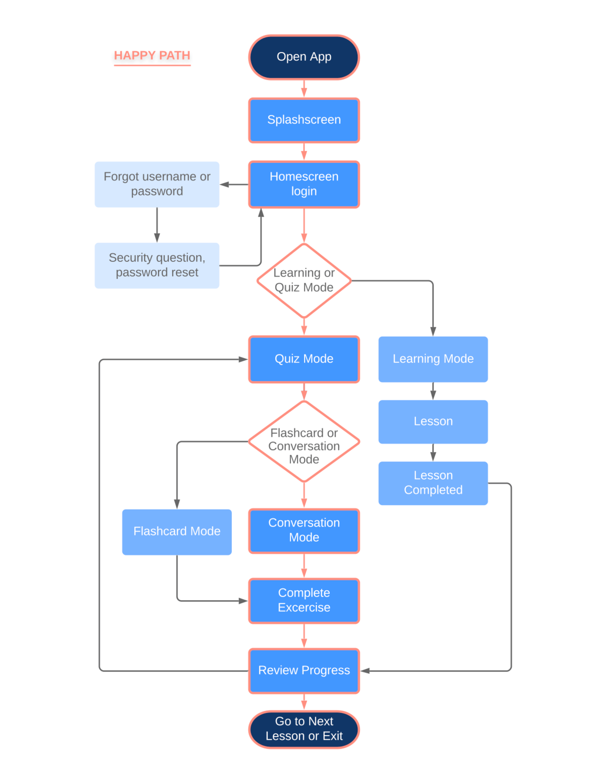
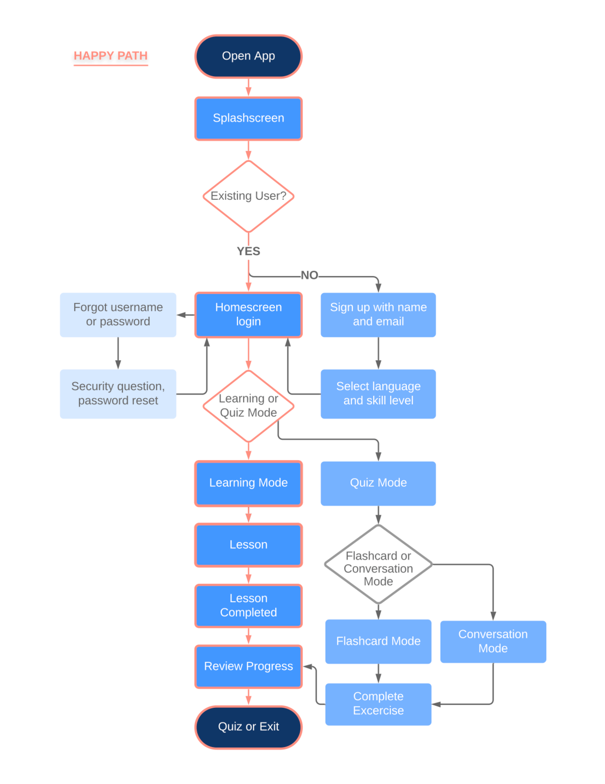
Reggie needs a way to practice her language skills and learn new languages that allows for flexibility, goal setting and motivation.
LEARN
QUIZ
Wireframes & Prototypes
We used our user flows to begin developing lo-fidelity wireframes and prototypes based on our personas needs.
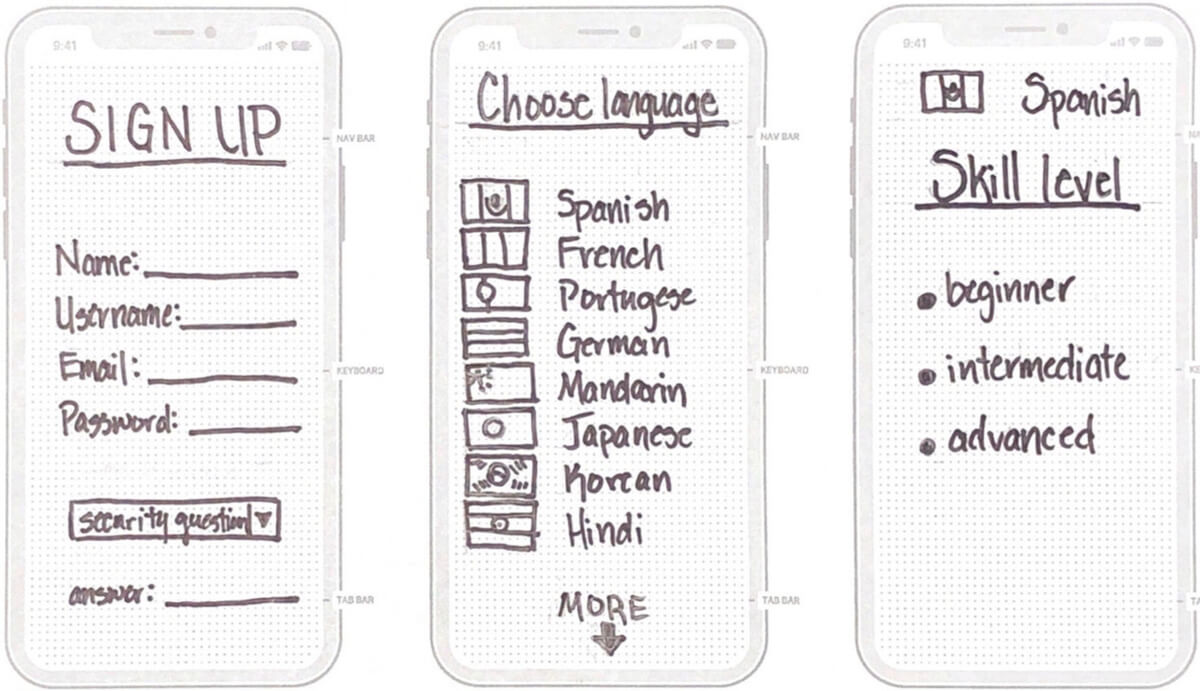
Sign Up & Onboarding
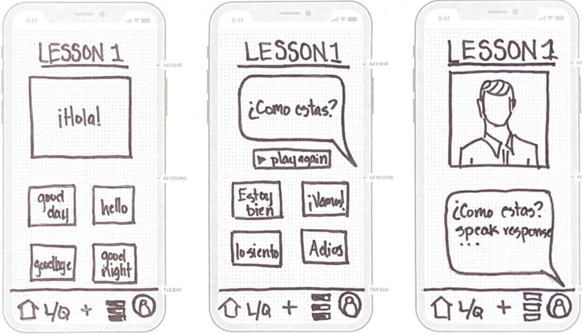
Learn Mode
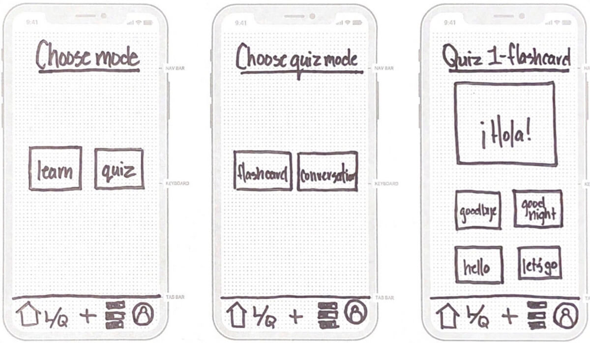
Learn/Quiz Mode
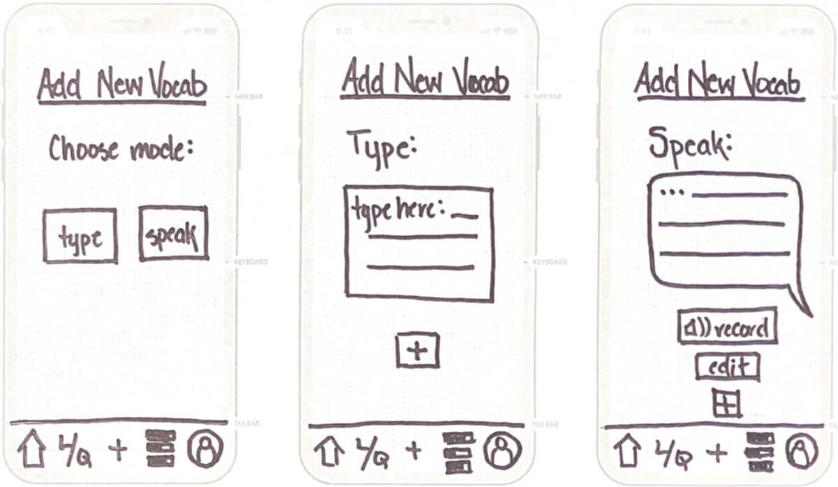
Add New Vocabulary
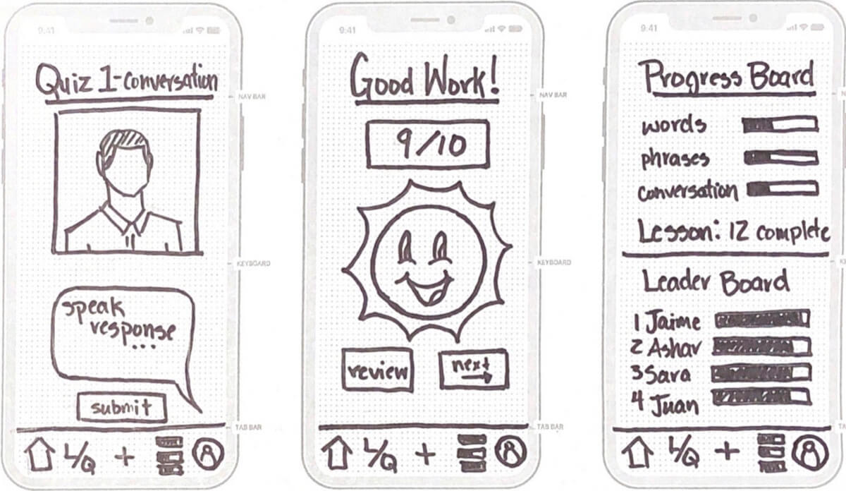
Quiz Mode & Progress
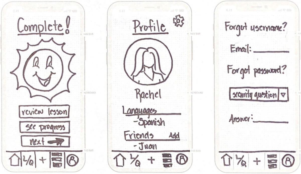
Profile & Admin
Usability Testing
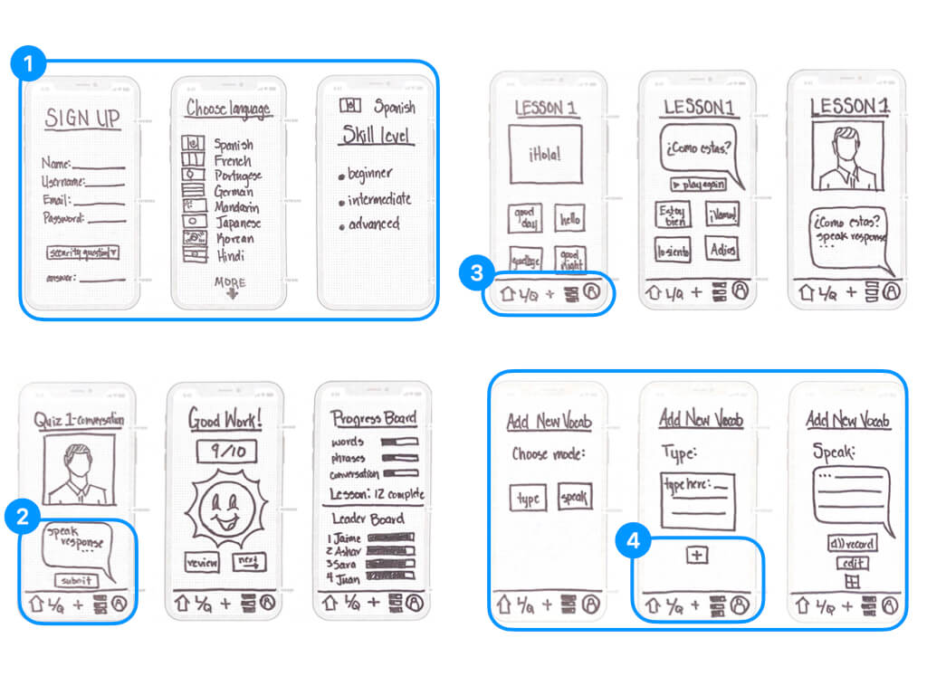
We began user testing early in the process and started getting feedback on our lo-fidelity prototype.
"Sign up and starting is easy."
"The bottom navigation buttons are confusing."
"There's no confirmation when I add a word."
Observations:
- Sign up and starting the first lesson is easy.
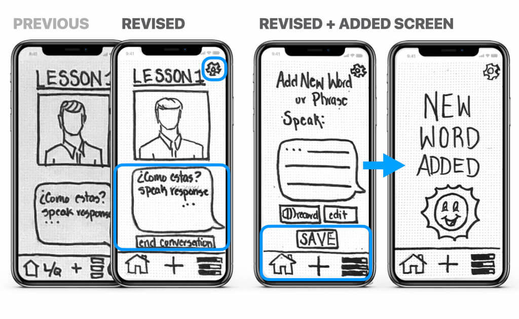
- The profile button at the bottom right and the speech bubble were confusing when completing a lesson.
- Navigation to quiz mode is confusing. Too many navigation buttons at the bottom of the screen.
- No confirmation of adding a new word or phrase. Having two ‘+’ buttons when adding a new word or phase is confusing.
Improvements:
- Removed unnecessary and confusing icons from the bottom navigation bar.
- Added clear options to select learn or quiz.
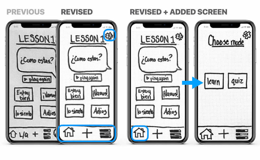
- User profile info can now be accessed from the settings icon at the top of the screen.
- The '+' icon on the screen was replaced with a 'save' button.
Mid-fidelity Wireframes
After usability testing, we produced another round of wireframes to develop the app in Sketch.
Mid-Fidelity: select a language & start a lesson
Tools used: Sketch, Keynote

Hi-fidelity Mockups
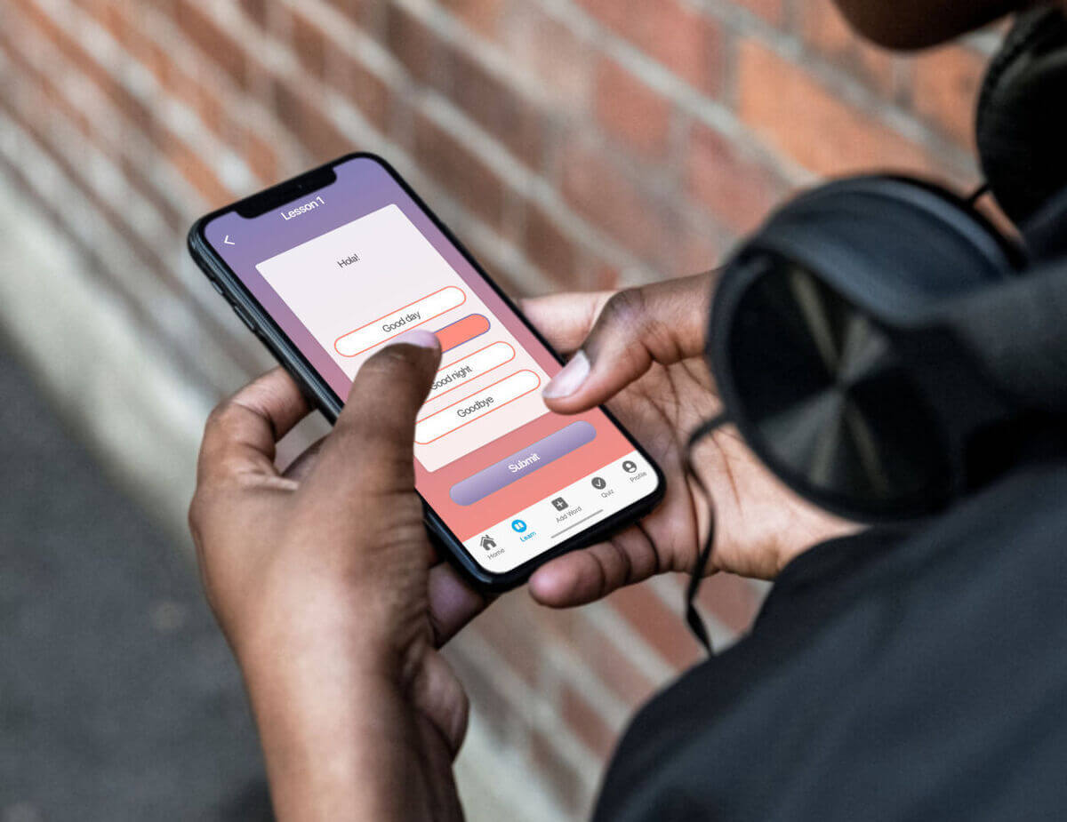
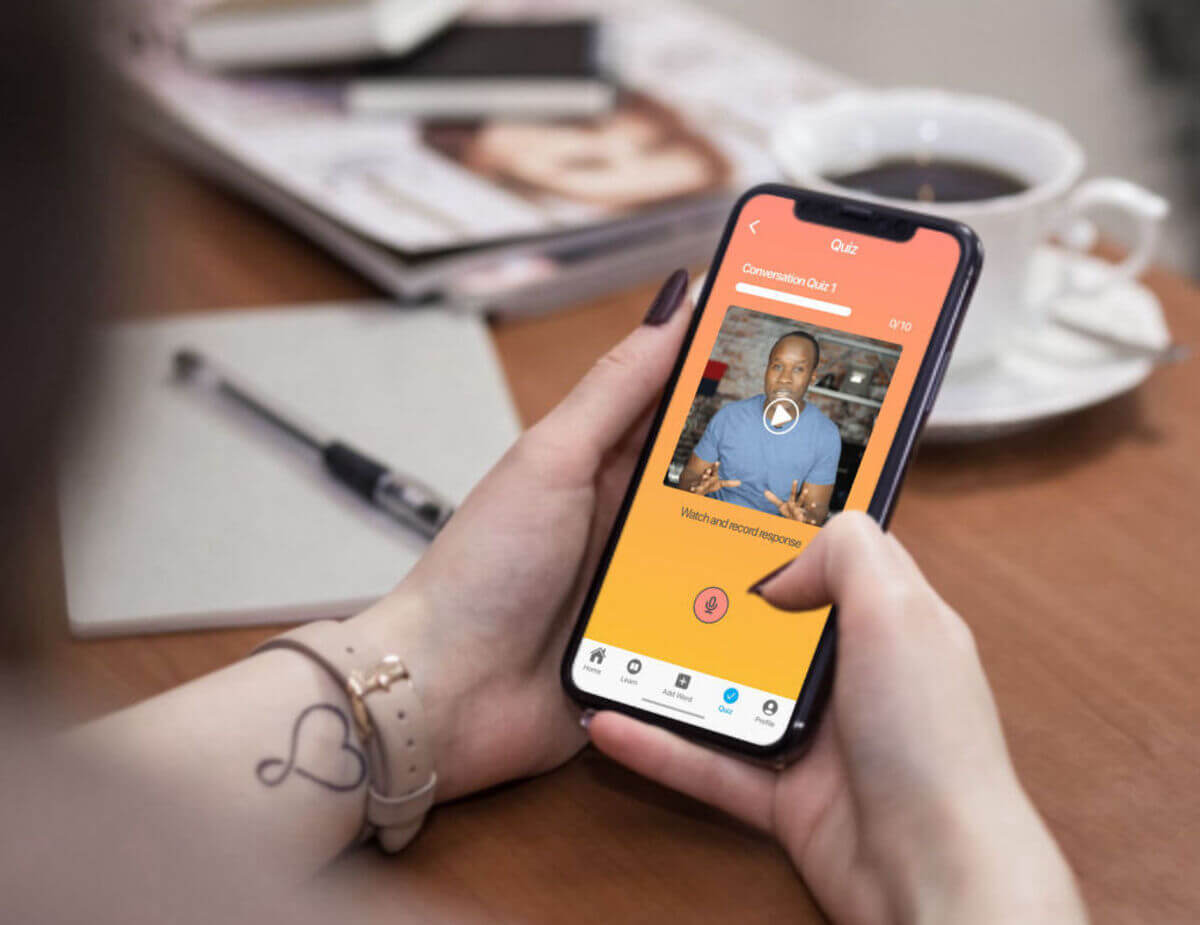
We further developed the UI, using color to emphasize transitions and improve user engagement.
Hi-Fidelity: select a language & start a lesson
Tools used: Sketch, Invision

Prototype
Main Takeaways
We began by exploring the competition and quickly defining our product with a proto-persona. We developed user flows that help guide a series of rapid lo-fidelity wireframes and prototypes. We used these quick prototypes to conduct initial user testing. We analyzed our results and determined ways to improve the product. We refined the UI, updated our prototype ,and completed a series of mockups.
