Map & Search Experience
The Problem
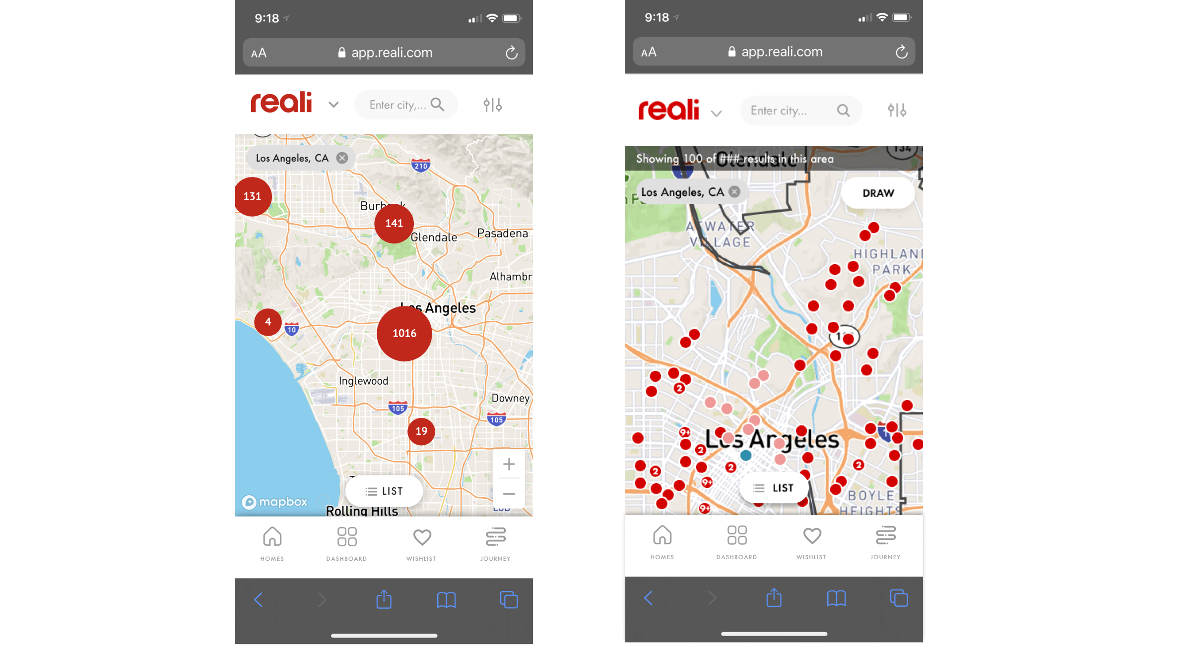
Our customers raised flags that our search capabilities do not compare to our competitors. The map view is confusing. The ability to search on the map is limited. When a user searches for a certain area, it is unclear how that area is being defined based on their search criteria.
Our customers often leave our app and use our competitor’s platforms to find property listings and learn about an area. This increases the chances of losing leads.
The Opportunity
To improve the map and search experience for both responsive web and mobile native platforms to keep users engaged. Key improvements include:
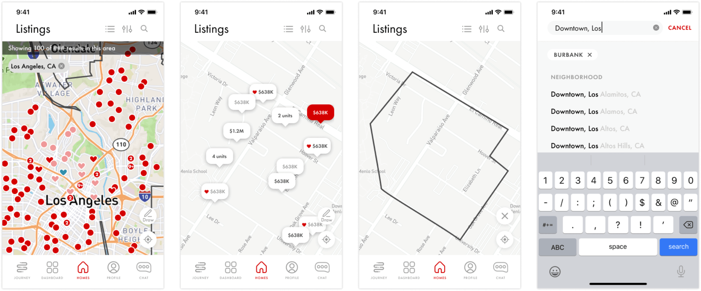
- Search in one click
- Search by school district and neighborhood
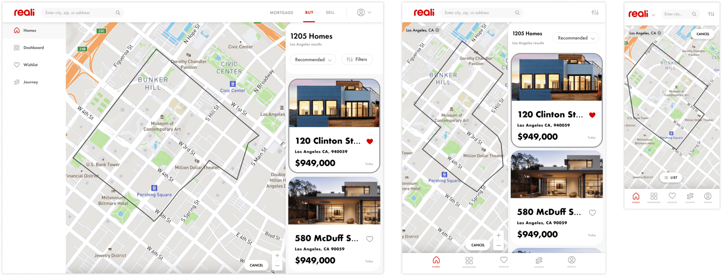
- User can draw area of interest on map
- Map shows outline drawn
- Improve location visualization (remove location clustering)
My Role
I led product and UX design including competitor research, design iterations and review, in partnership with product managers and the engineering team.
Design Enhancements
Initial Map & Revised Map Views
Draw Feature (responsive web)
Map, Draw and Search (native mobile)
Impact
123%
Increase in active users 30 days after launch
151%
Increase in mobile app downloads 30 days after launch
68%
Increase in returning daily users 30 days after launch
Property Listings
The Problem
To make a fully-informated decision on a home, our customers need more details than we currently provide on our listings pages. We need to keep customers engaged with our platform and decrease the odds that they will search for answers from our competitors.
Reali isn’t just a discovery platform for real estate listings. We offer end-to-end services for buying and selling. We need to better inform customers of those services and higlight them on our listing pages.
The Opportunity
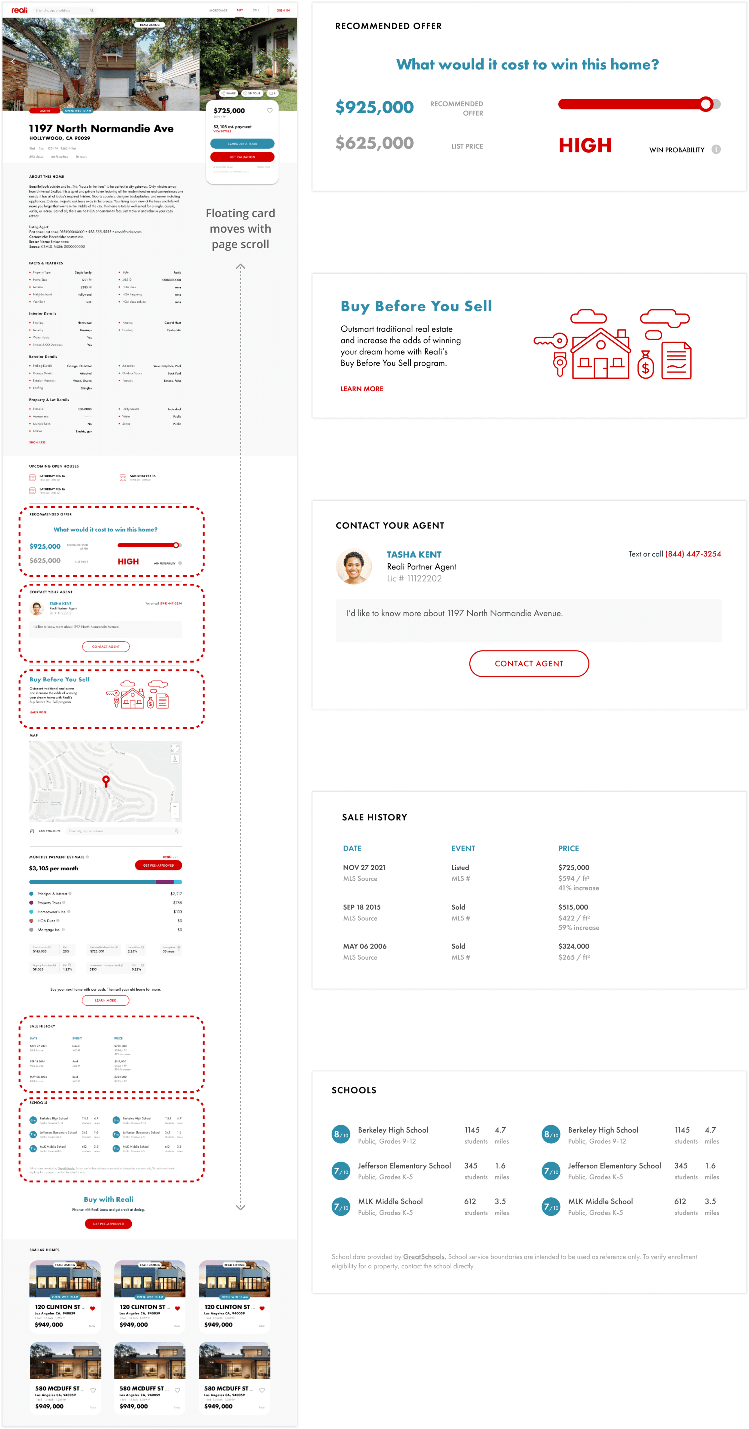
To build a listing page that includes all the information customers need to make an informed decision about buying a home on both web and mobile apps. Key additions and enhancements include:
- Ability to view all images directly from the page
- Status of the listing (active, pending, contingent, sold)
- Popularity data (number of views, favorites, and tours)
- More facts and features details
- Recommended offer amount
- Ability to contact an agent
- Ability to calculate commute
- Sale history
- School data
- CTAs to learn more about Reali’s services (Loans, Buy Before You Sell, etc.)
- Similar listings
My Role
I led product and UX design including competitor research, design iterations, user surveys, and review, in partnership with product managers and the engineering team.
Design Enhancements
Impact
182%
Increase in property listings viewed on web 30 days after launch
164%
Increase in property listings viewed on mobile 30 days after launch
173%
Combined increase in listings viewed 30 days after launch
Financial Verification
The Problem
Agents request financial verification documents, typically a pre-approval letter and proof of funds, and customers supply them via email. This process isn’t secure, is tedious and the documents can only be accessed by those who receive the email.
While the customer typically uploads proof of funds and other documents as part of the loan application, they can only be accessed by the loan officer. Customers need the ability to upload these documents in a secure place where both agents and loan officers can review them.
The Opportunity
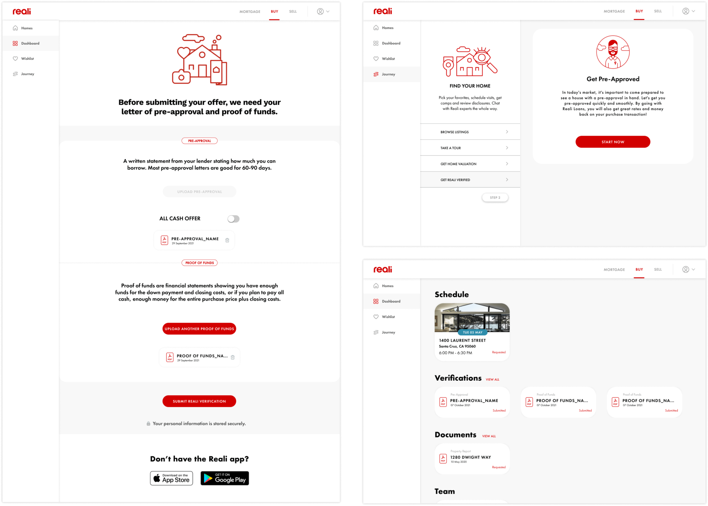
Users need a secure place to upload financial documents where agents and loan officers can review them. Key improvements include:
- Ability to upload 1 preapproval doc and multiple proof of funds documents
- Ability to download, view, and delete uploaded documents
- Ability to start the pre-approval process from this page
- View financial verification status
- Access the financial verification documents from multiple locations: the dashboard and the journey
My Role
I led product and UX design including design iterations and review in partnership with product managers and the engineering team.
Design Enhancements
Impact
Increase transparency across internal teams
Increase loan pre-approval applications
Decrease number of offer requests via email
Loans Rate Quote
The Ask
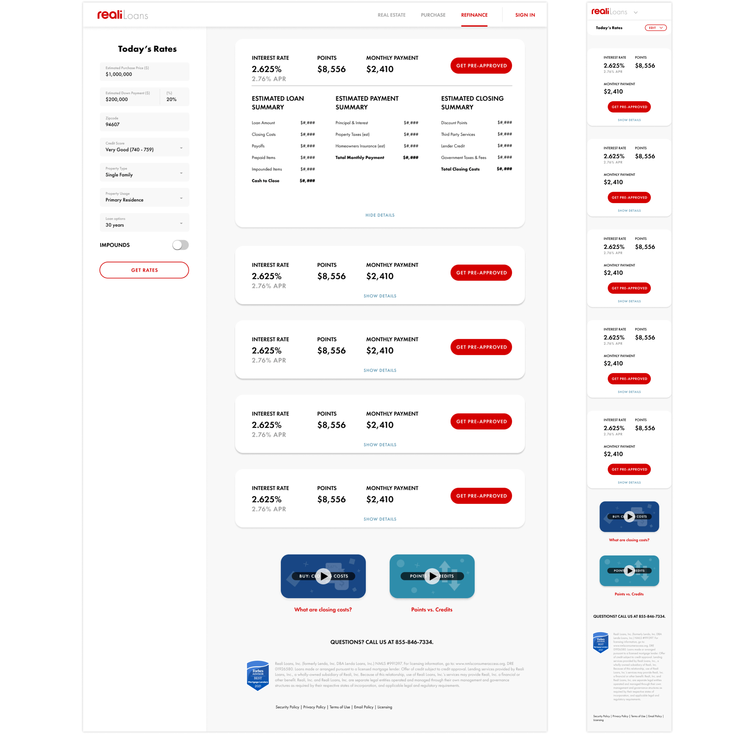
The Reali Loans rate quote page needs to accommodate a few new components to satisfy business requirements and user feedback. These include the addition of FHA and VA loans, videos explaining points vs. credits, and the ability to add/change the down payment percentage.
The Opportunity
The business has asked that we add more loan types. Users have requested a more thorough explanation of key terms, a more detailed cost summary and the ability to change more inputs. Key improvements include:
- Addition of FHA and VA loan types
- Addition of videos explaining points vs. credits
- Ability to change down payment percent
- Better organized and more thorough breakdown of payment and cost summary
My Role
I led product and UX design including design iterations and review in partnership with product managers and the engineering team.
Design Enhancements
