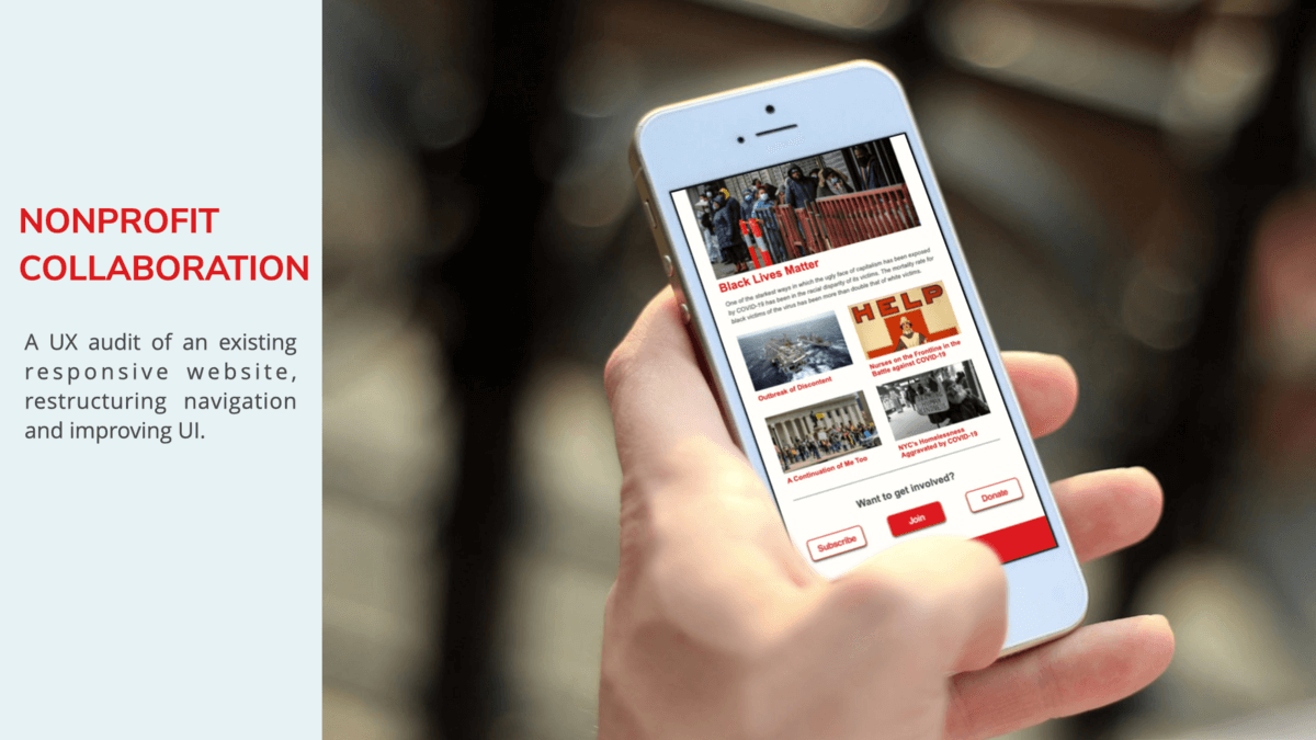
About the Project
Maintaining a responsive site with a respository of multi-media content is a complex task. I collaborated with a diverse team, including the chief marketing officer, designers, and developers, to design, build, and test site navigation and multi-media content. I also conducted competitive research, site mapping, and completed a style guide.
Research
- Competitive Research
- Site Mapping & Card Sorting
Design
- Wireframes & Mockups
- UI Style Guide
Testing
- Usability Testing
- Preference Testing
Tools used: Lucid Chart, Optimal Sort, Figma
Site Mapping & Card Sorting
We reviewed the current site structure, and began to analyze how we might streamline the navigation.
User Site Map

Card Sorting
To assess the structure of our site map, we conducted a hybrid card sort with 20 participants using OptimalSort. The test included 30 cards with content topics with 5 pre-defined categories. We're in the process of compiling data and assessing the results.
Wireframes & Mockups
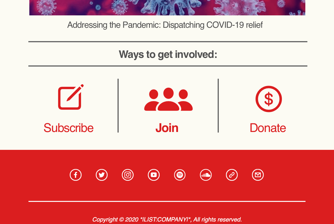
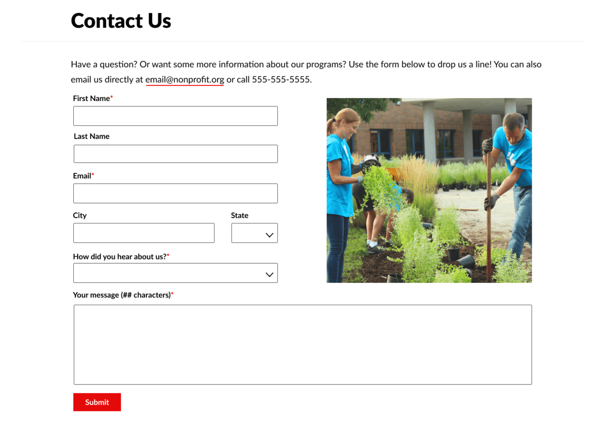
We started refining the design of some website features, starting with forms and CTAs. We're in the process of further refining the UI to maintain consistency across the site.
CTA buttons: Option 1
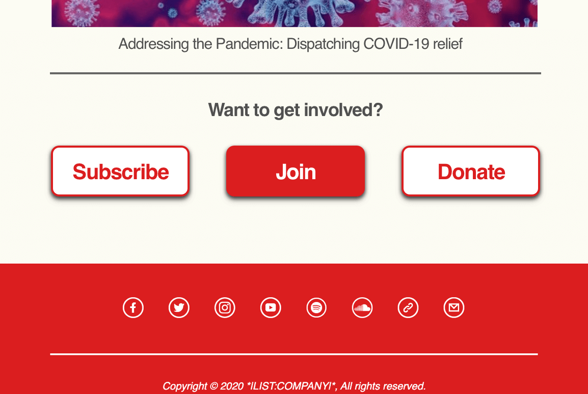
CTA buttons: Option 2
Join Form
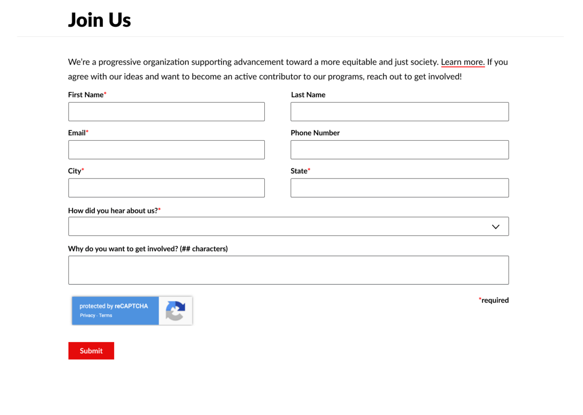
Contact Form
Main Takeaways
This is an ongoing project with a dynamic, cross-functional team committed to improving the usability of an existing site. From user research and site mapping to usability testing and refining the UI, I'm involved in all UX facets of the project.