Usability Testing: Purpose & Goals
Purpose of the Study
This study is meant to test Refab, an app that connects users with home improvement professionals. Participants will be asked to perform tasks using the app and answer questions about their experience. The app is being tested so that further adjustments can be made prior to the final release. Participation in this study will help the design team make sure the app is enjoyable and easy to use.
Goals
The goal of this study is to assess the learnability of the mobile and desktop apps for new users. We intend to observe and measure if users understand the app and can complete basic tasks (sign up/log in, finding a professional, scheduling a video call, etc.).
Test Objectives
- Determine if users understand the purpose and value of the app quickly
- Observe how users sign up/sign in
- Observe how users find a professional
- Observe how users schedule a video chat call or a service
Methodology
The in-person moderated tests will be conducted either in the facilitator’s home, the participant’s home, or a public place as agreed upon by both parties. The remote moderated tests will be conducted using Zoom and recorded using Quicktime. Each test will include a short introduction, task performance on Refab for mobile and desktop, and a debriefing.
Participants
A minimum of 6 participants will be selected to participate in testing.
Sessions
Participants will individually engage in 15-20 minute usability test sessions. The first 3 participants will begin on the mobile app and switch to desktop, and the second group of 3 will begin on desktop and switch to mobile.
Equipment
In-person moderated testing will be carried out on an iPhone 10 and a MacBook Pro. Remote moderated testing devices (mobile and home computer) are dependent on the participant. Remote moderated test participants will need a stable internet connection.
Metrics
Errors will be measured using Jakob Nielsen’s scale:
- 0 = I don't agree that this is a usability problem at all
- 1 = Cosmetic problem only: need not be fixed unless extra time is available on project
- 2 = Minor usability problem: fixing this should be given low priority
- 3 = Major usability problem: important to fix and should be given high priority
- 4 = Usability catastrophe: imperative to fix before product can be released
Usability Testing: Test Script
Introduction
Refab is a mobile and desktop app that connects users with home improvement professionals using video chat. We’ve just put together our initial prototype, and we want to get feedback from users so we can continue to improve the product before launch. We’ll start the session with a few basic questions and then complete a few tasks using the app.
Remember that we’re testing the app, not the users, so there are no wrong answers. Please feel free to add commentary and ask questions along the way. If there are any points where you are stuck or confused, I’m here to answer questions and discuss the problem. The app is still a prototype, so we’re looking for feedback that will help us find triggers and pain points that need to be resolved.
As we mentioned on the consent form, we would like to record your screen and voice during today’s testing session. Would that be ok? The recording will only be used by the design team to help us understand how to improve the app and will not be used or distributed for any purposes outside this project.
Demographic questions
- What’s your age range? 21-25, 26-30, 31-35, 36-40, 41-45
- What’s your occupation?
- Do you rent or own your home?
Background Questions:
Before we use Refab, I’d like to ask a few questions to get a better idea about how you might use the app:
- How do you typically search for information for home improvement projects?
- How do you typically find home improvement professionals?
- Can you think of specific situations that this app would be helpful?
Open-ended questions
Now we’d like to show you the app just to get your first impressions.
- Spend some time looking over the home screen. Without clicking anywhere yet, can you tell me your first impressions?
- What do you like? What do you not like?
- What do you think about the information displayed on the page?
- From the home page, can you tell us what you think the purpose of the app is?
Now, we’d like to ask you to try out some activities using the Refab app.
Tasks
We have three scenarios with corresponding activities. As you complete each task, we’d like you think out loud and tell us about your experience as you navigate the app.
- You’d like to remodel your bathroom and are considering doing some of the work yourself. You’ll probably need to hire a professional, but you’d like to get a better idea of who’s available in your area. A friend recommends Refab to search local home improvement pros. You download the app, sign up and browse the list of professionals and reviews. On a scale of 1-7, with 1 being very difficult and 7 being very easy, how would you rate this task?
- You’d like to install a brick patio in your back yard, but you don’t have much experience doing masonry work. You recently signed up for Refab and want to try the video chat feature. You log in to the app, schedule and pay for a video call with a pro. On a scale of 1-7, with 1 being very difficult and 7 being very easy, how would you rate this task?
- Your bathroom remodel is getting a little out of hand and you need help. You’ve been using Refab for video calls and want to book a service. You log in to the app, schedule and pay for a service with a pro. On a scale of 1-7, with 1 being very difficult and 7 being very easy, how would you rate this task?
Wrap Up
That’s the end of the session. Thanks for participating and helping us better understand how we can improve Refab. Do you have any questions or feedback for us?
Usability Testing: Analysis
We used affinity mapping to sort the feedback into four categories:
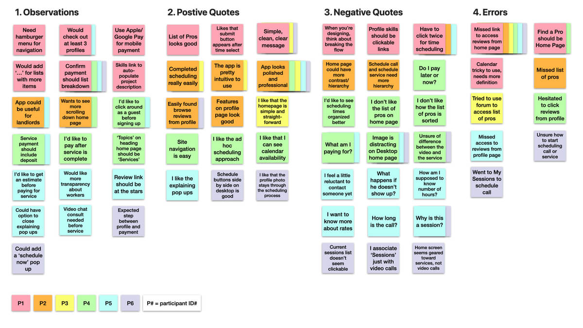
We further analyzed the data and began categorizing each point by level of severity. We also began investigating possible solutions.

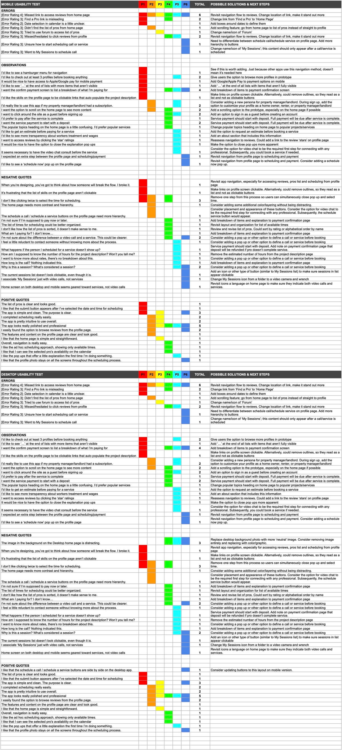
Usability Testing: Test Report
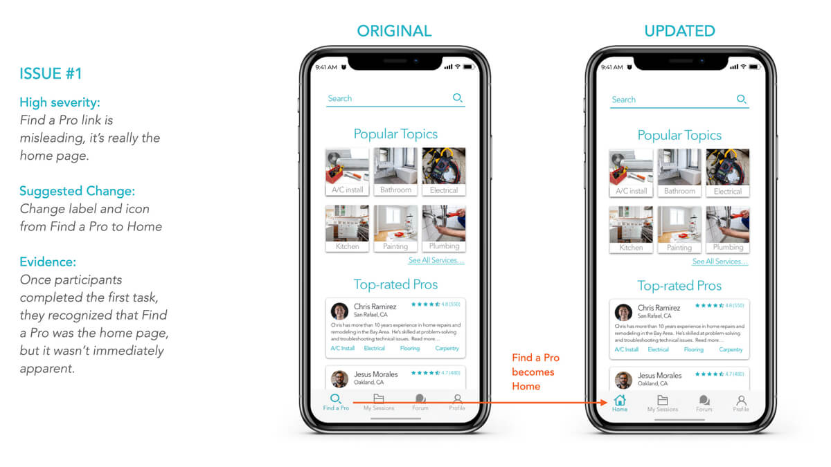
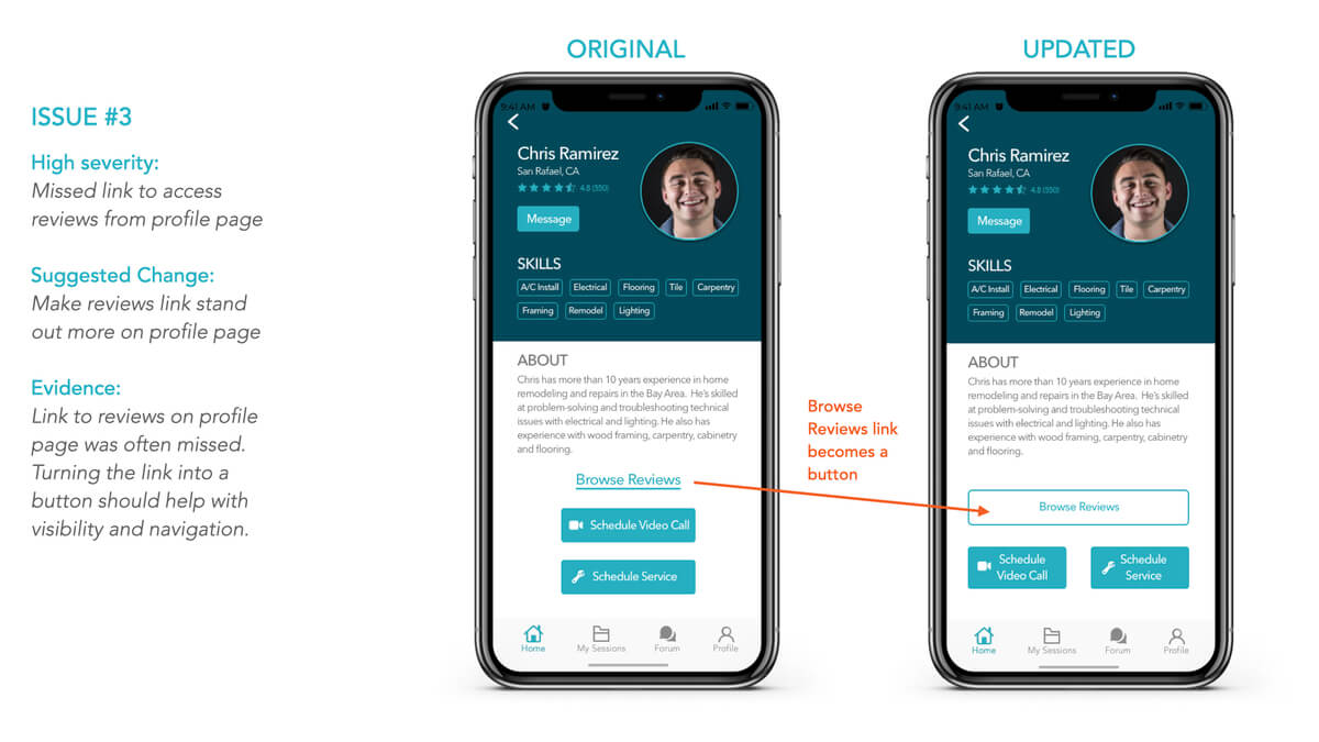
Takeaways
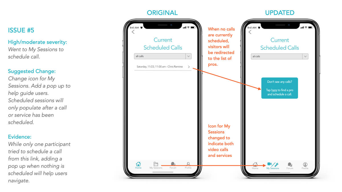
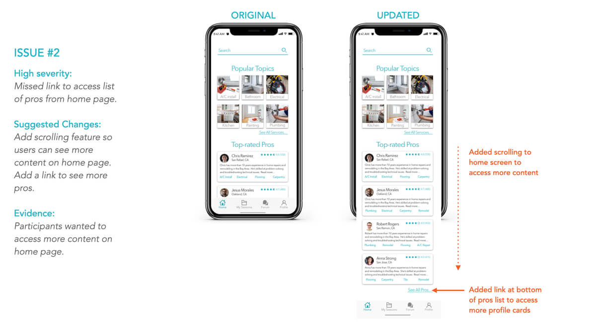
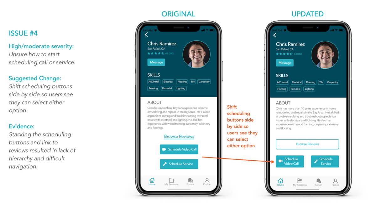
We had several key findings from our usability testing that resulted in updates to the product. We updated the navigation to and layout of the home screen, changed the layout of the profile screen, and added notifications to help guide users through scheduling. We continued testing while updating our prototype as part of our ongoing process to understand our users' needs.