About the Project
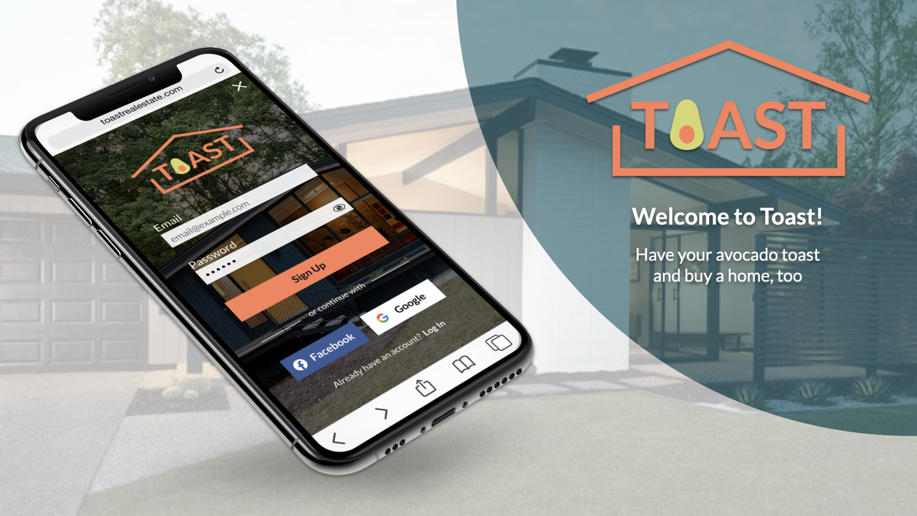
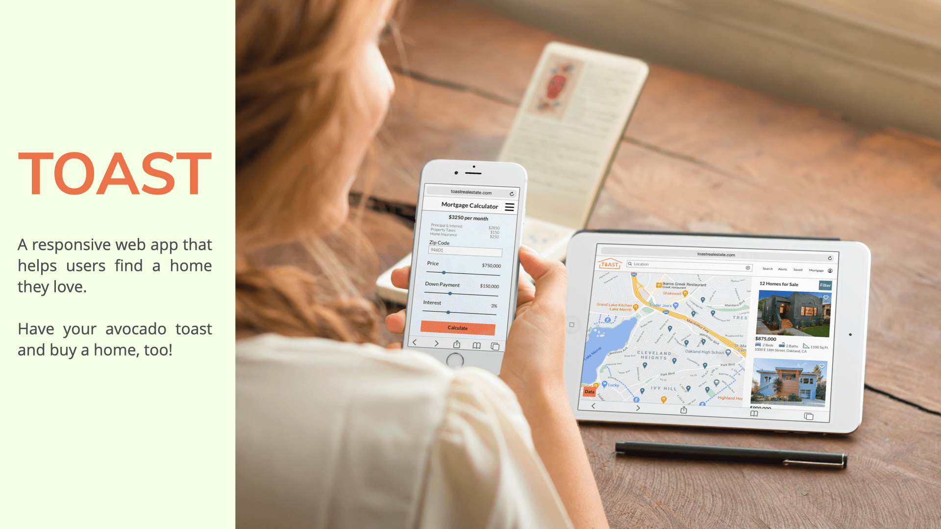
Buying a home is a time-consuming and sometimes challenging process. Toast helps users quickly browse listings, get mortgage info, and connect with real estate agents. Our goal is to help support those new to real estate during the buying process.Users need a way to quickly search and filter properties, save results, calculate mortgage rates and payments and connect with real estate professionals.I was responsible for UX/UI design including:
Research:
Final UI:
Tools used: Sketch, Invision, Lucid Chart, Principle
Competitive Research
We took a look at three competitors to better understand the market and determine how to set our product apart.
Redfin

Key Takeaways:
- Design uses a bold primary color, but tends to be more reserved.
- Properties only include those for sale.
- Provides market insights on other local property offers and sales.
Trulia

Key Takeaways:
- Playful design choices differentiate from competitors.
- Properties include those for sale and for rent.
- Showcases map data about schools, traffic, shops, etc.
Compass

Key Takeaways:
- Design aesthetic is minimalist.
- Properties include those for sale and for rent.
- Partnerships with developers on select new construction projects
User Personas
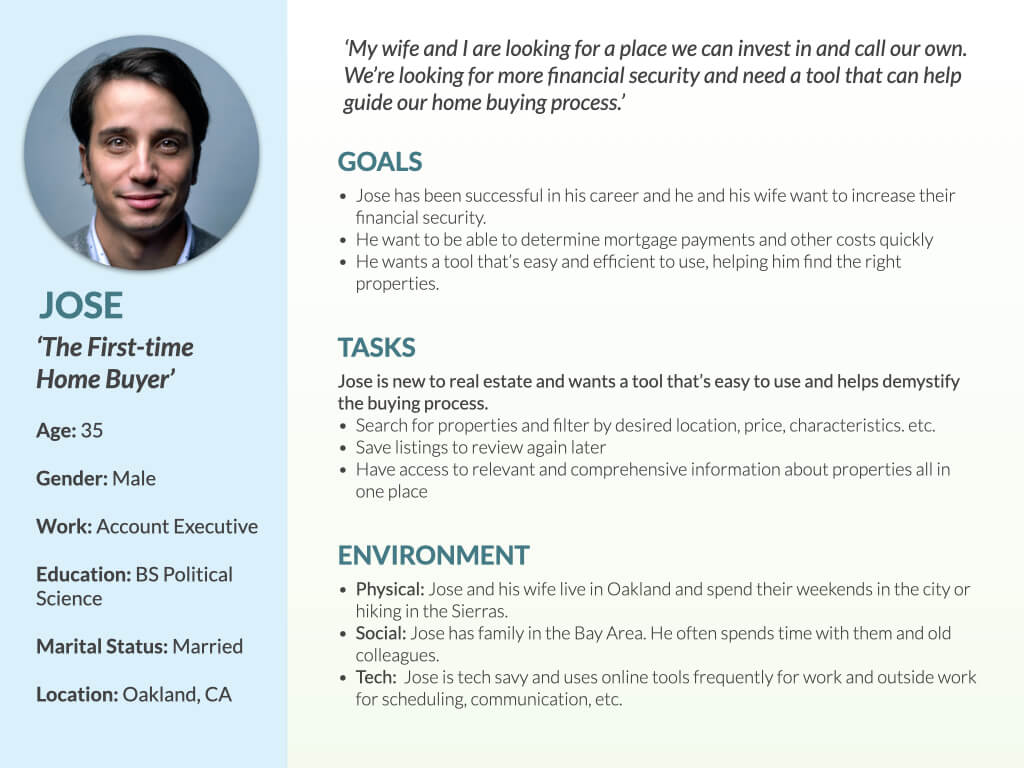
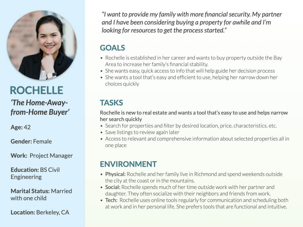
We used our competitive research to develop our user personas: Jose is a first-time home buyer and Rochelle is looking for a ‘home away from home’.
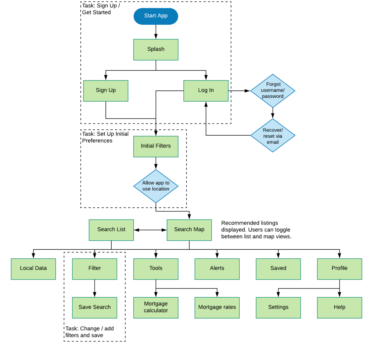
Site Map
Jose and Rochelle need an app that will help them find the right properties quickly and provide comprehensive information when they need it.
Our personas need to accomplish 3 key tasks:
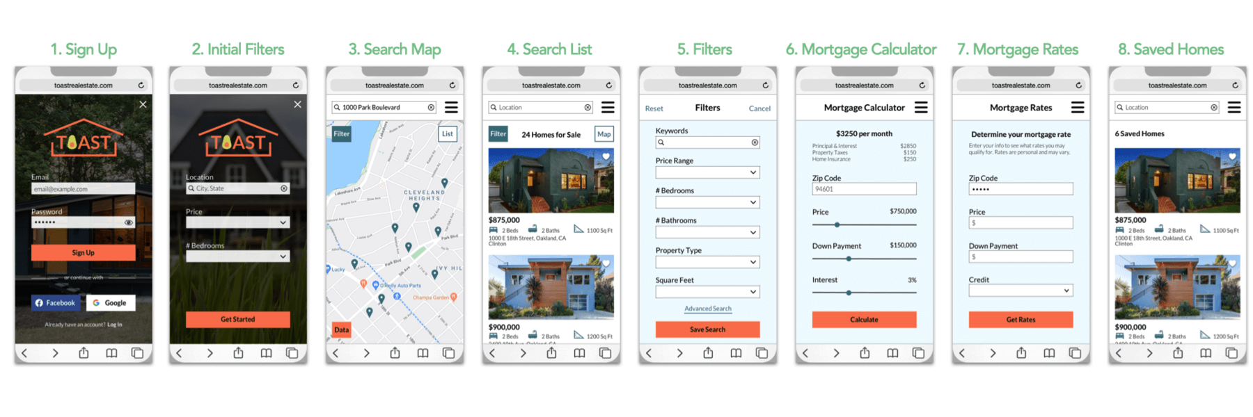
- Sign up for an account
- Set up filters and save preferences
- Search for properties and save favorites
Wireframes & Protoypes
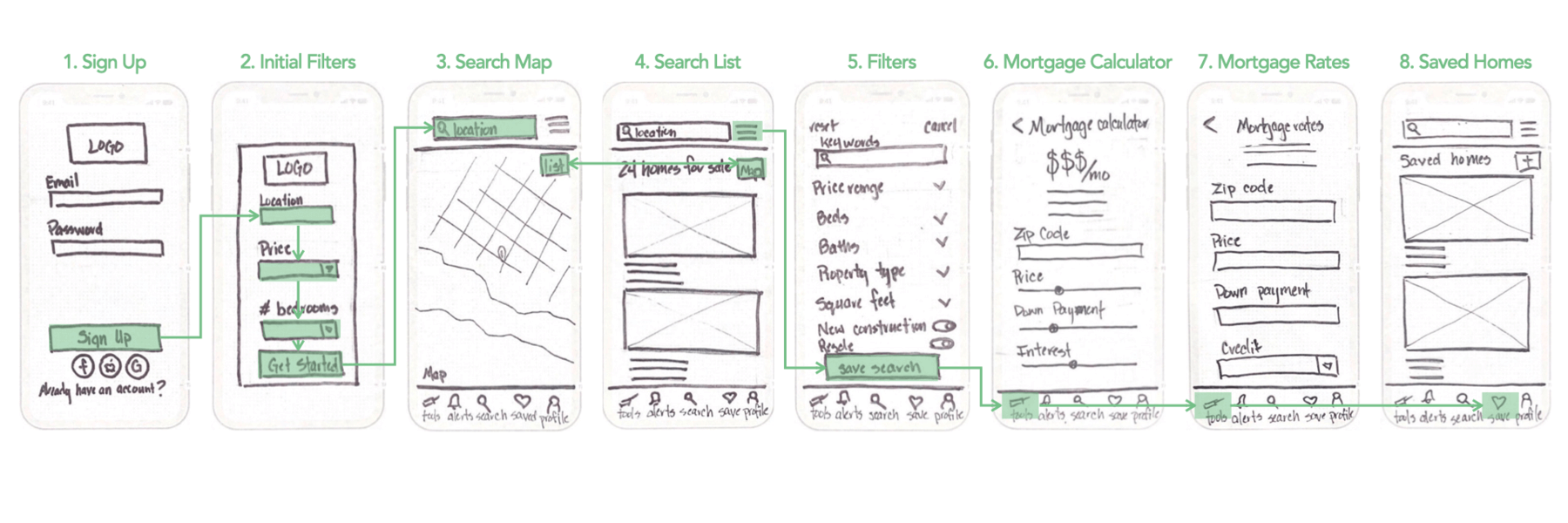
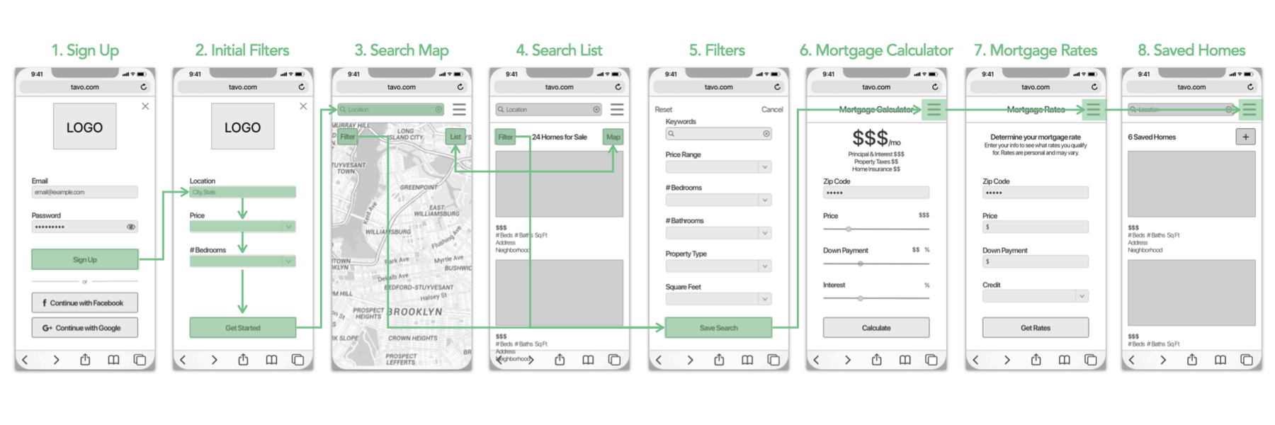
We used our site map to start quickly developing lo, mid-fidelity wireframes and prototypes.
Lo-fidelity Wireframes
Tools used: paper & pencil, Keynote
Mid-fidelity Wireframes
Tools used: Sketch, Keynote
Visual Design Concept
Before developing our hi-fidelity mockups, we defined the visual design approach with color, type, and imagery.
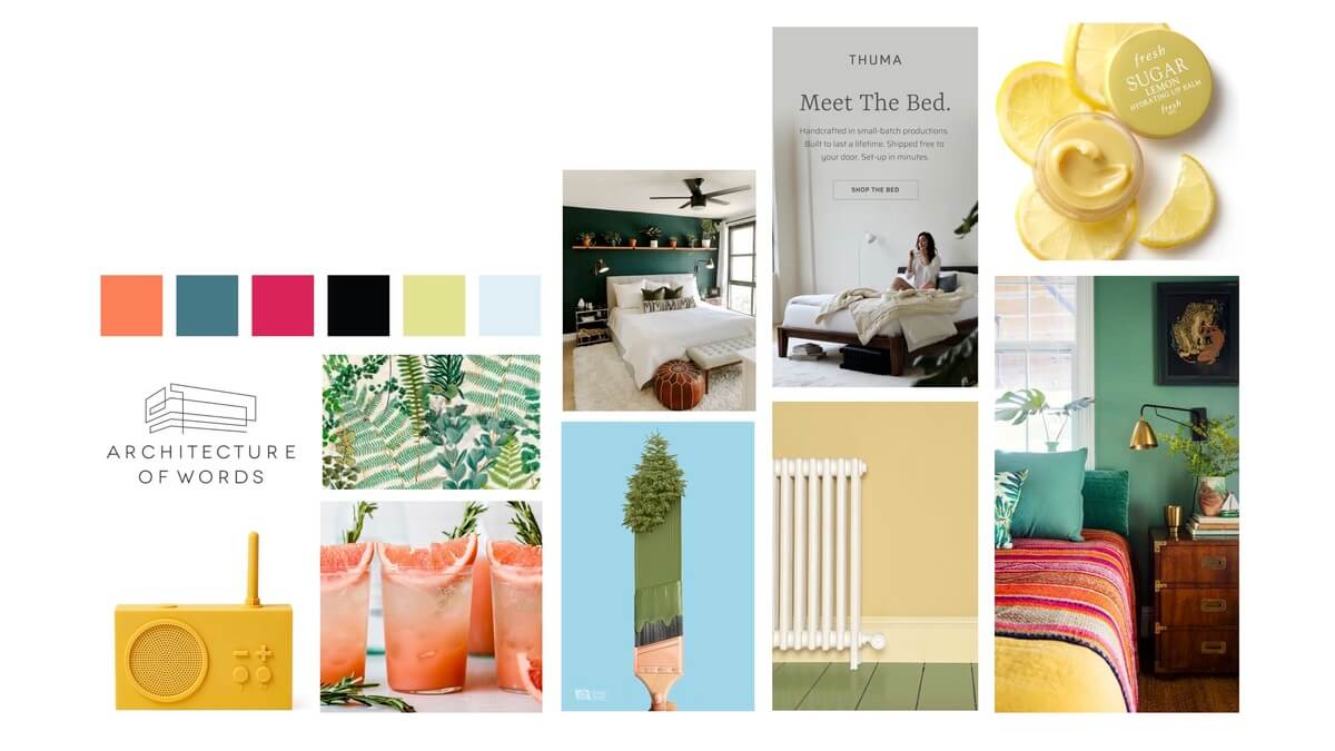
Mood Board: fresh, clean, new, healthy, balanced, bright
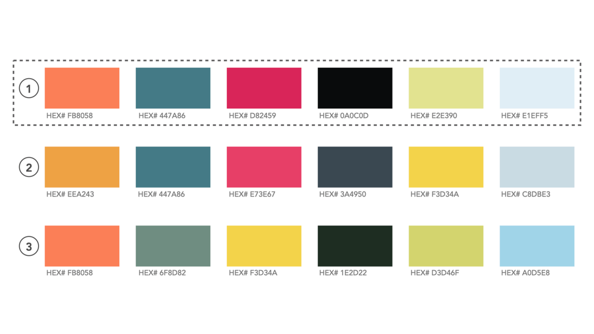
Color Palette: We selected a palette that offers a vibrant primary color, complimentary secondary color, with contrasting bold colors and tints.
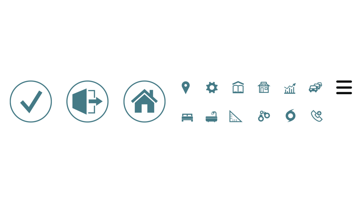
Custom icons: Custom icons were created to supplement those available in the SF Symbols kit. Each icon is simple and intended to be legible at a small scale.
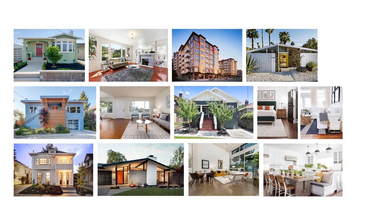
Selected images: fresh, approachable, bright, legible, clean
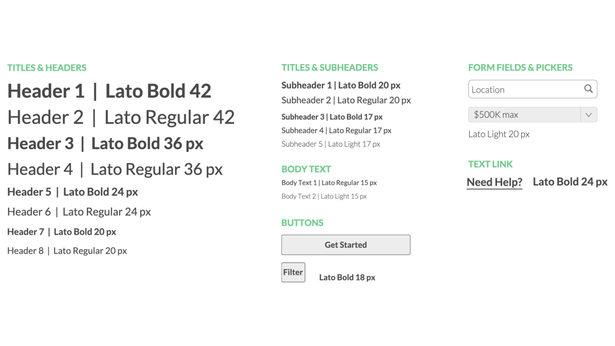
Typography: Lato has a fresh, approachable appearance that compliments our intended aesthetic.
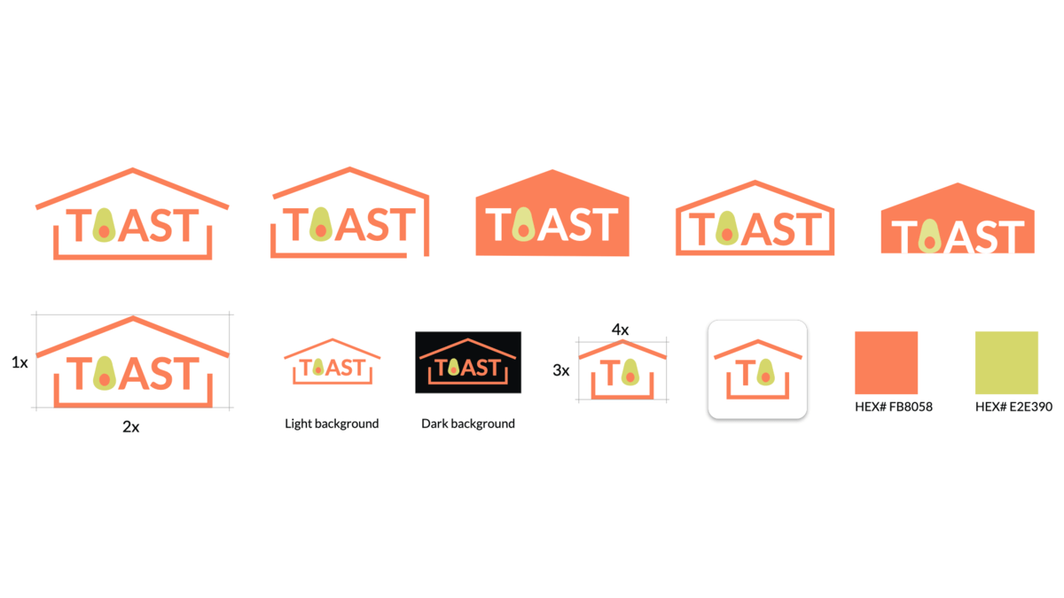
Logo design: We studied a range of options for the brand logo and determined that an open, lighter-feeling design compliments the app’s aesthetic and overall approach.
Hi-Fidelity Mockups
After defining our visual approach, we transformed our wireframes into hi-fidelity mockups for a range of breakpoints.
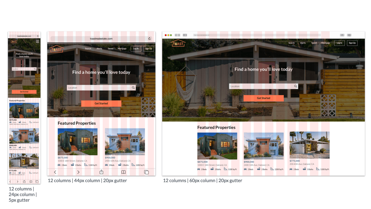
Breakpoints & Grids: mobile (345px), tablet (768px), desktop (1440px)
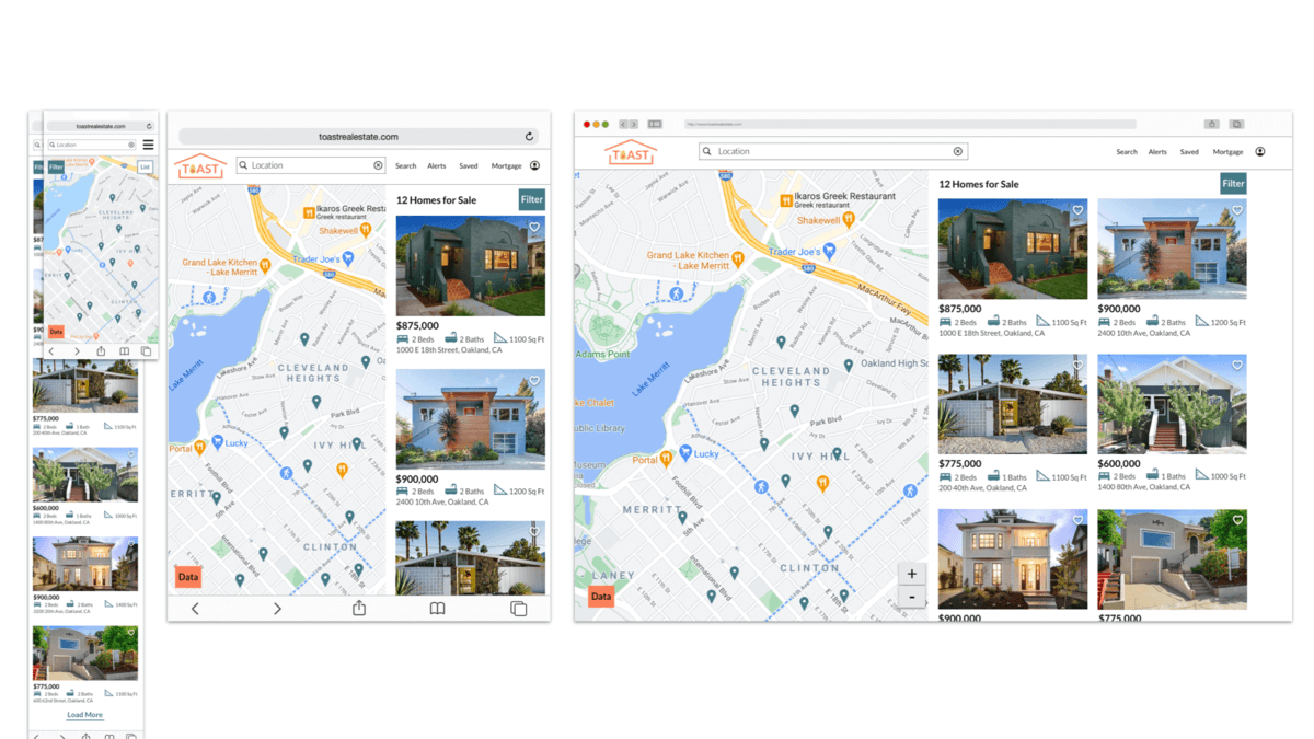
Property Search: mobile, tablet, desktop
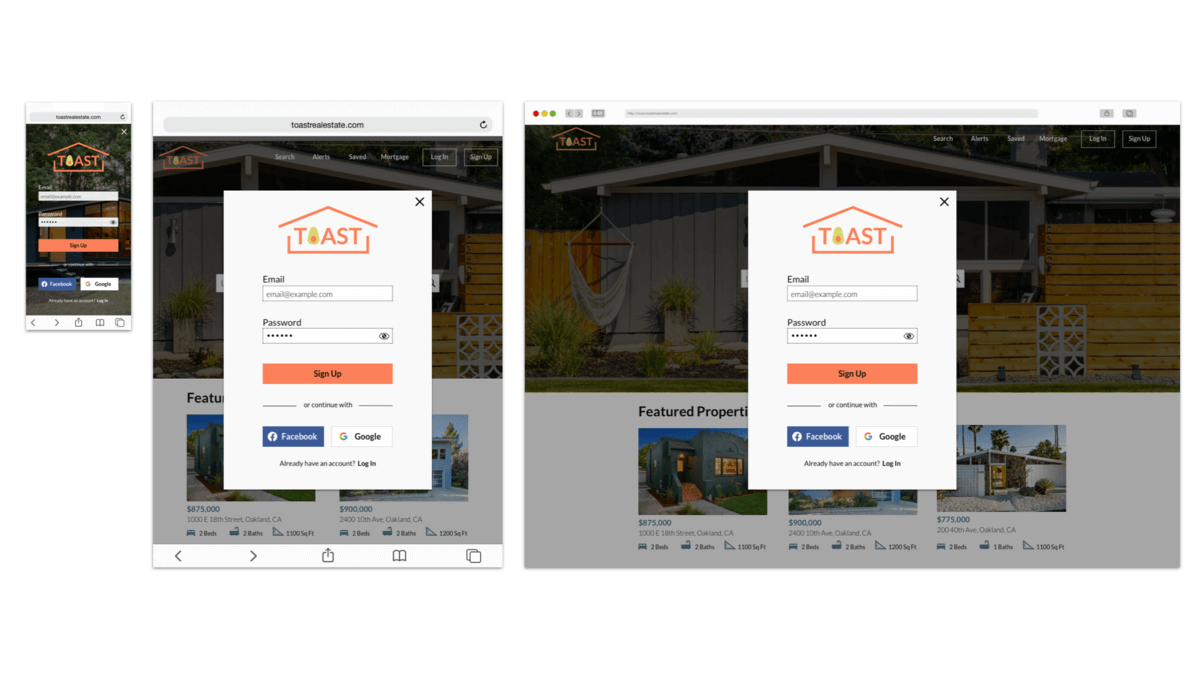
Sign Up: mobile, tablet, desktop
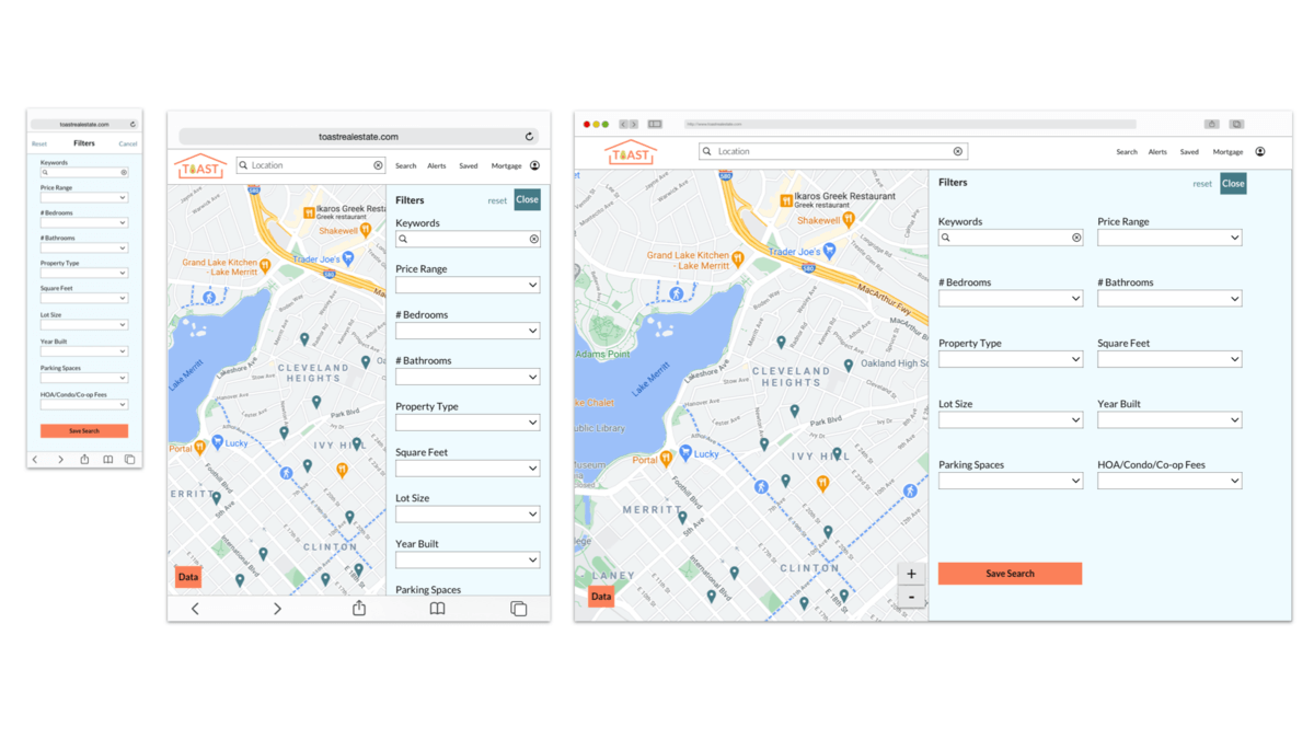
Filters: mobile, tablet, desktop
UI Style Guide
We developed a color palette, typography selection, brand logo and iconography.
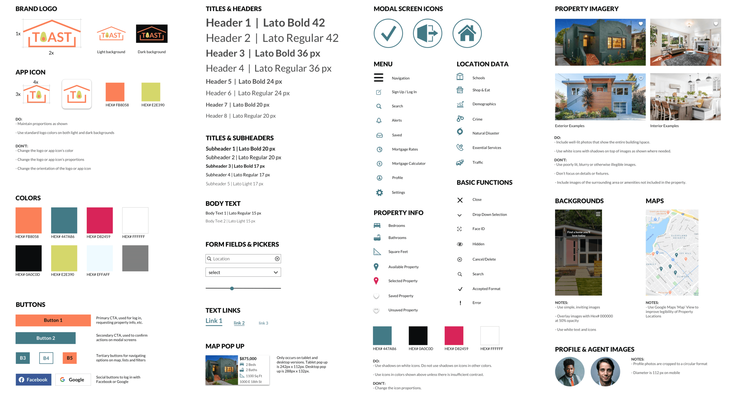
Animations
We animated a few screens to show proposed interactions for menu navigation, searching properties, and quickly viewing property info.
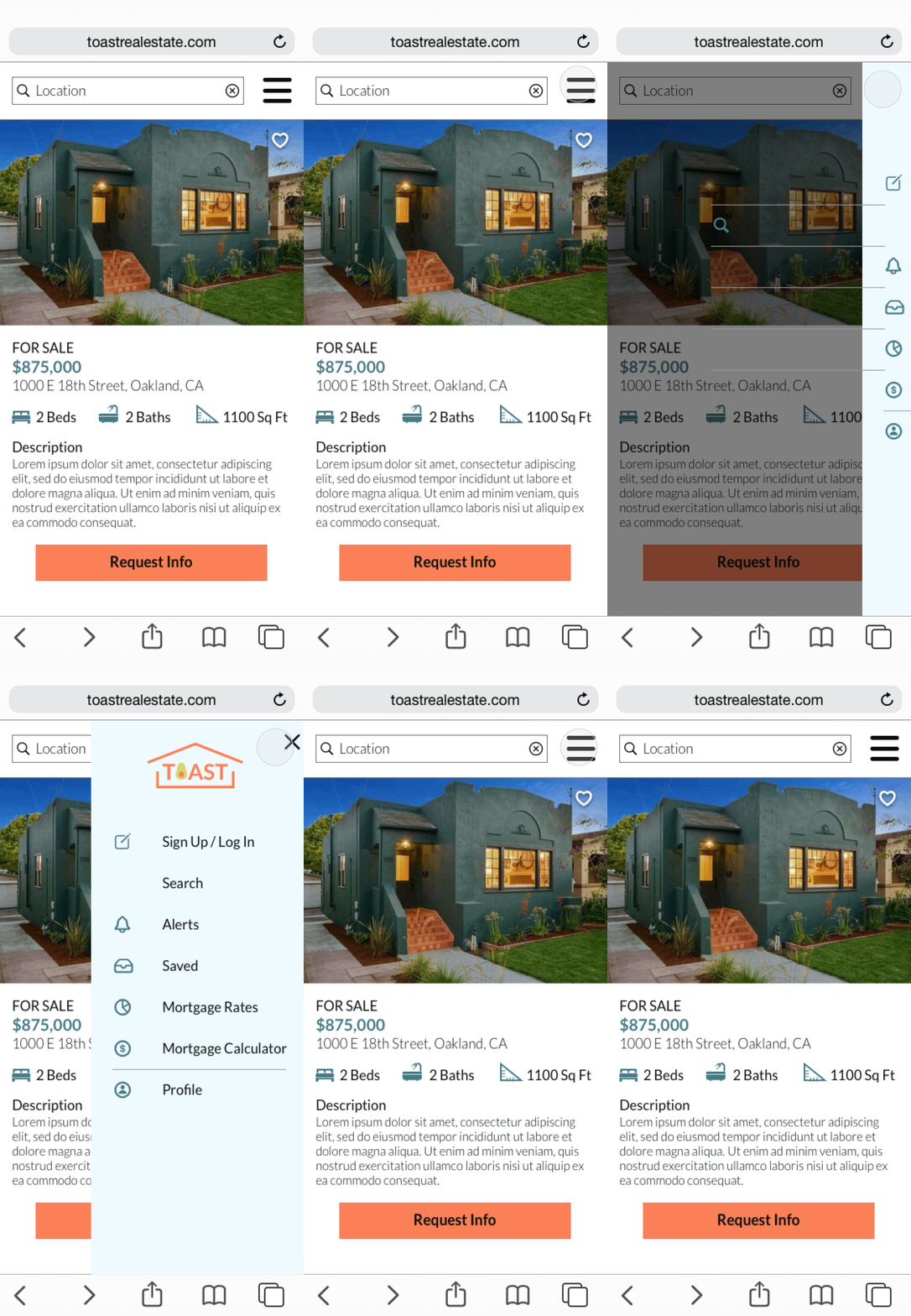
Navigation menu
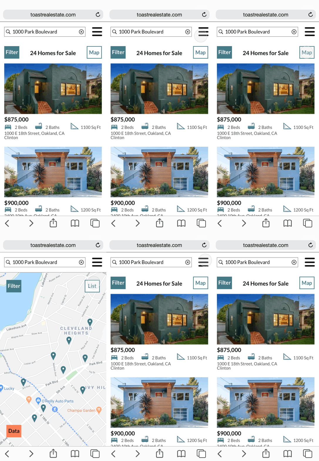
Search: Map to List
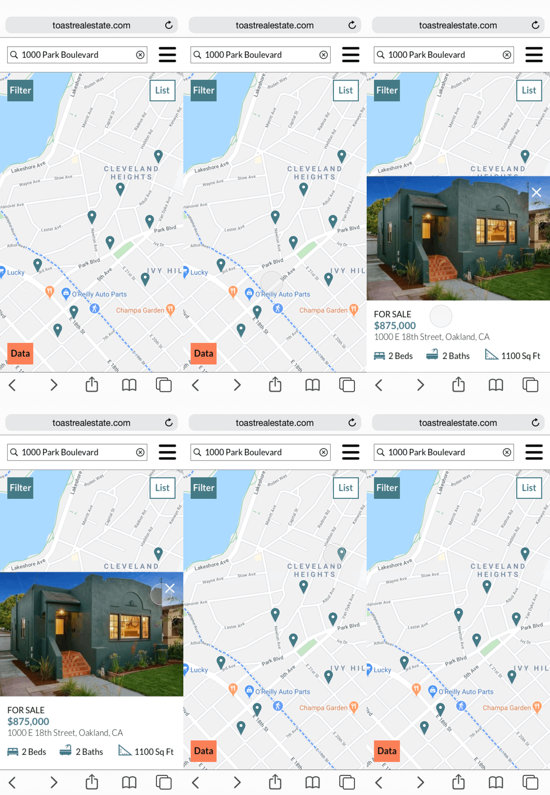
Property Quick View
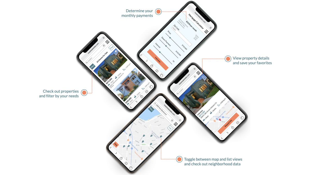
Final Mockups
With our responsive web app defined ready for hand off, we developed final mockups to showcase the UI.
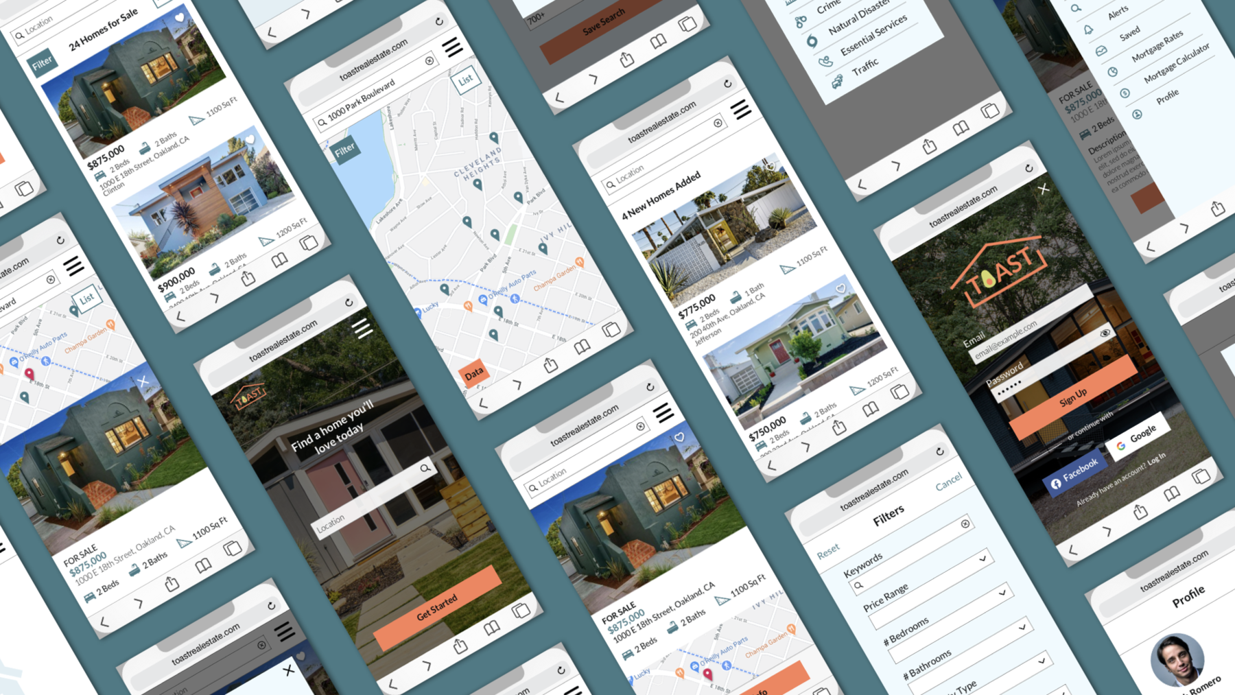
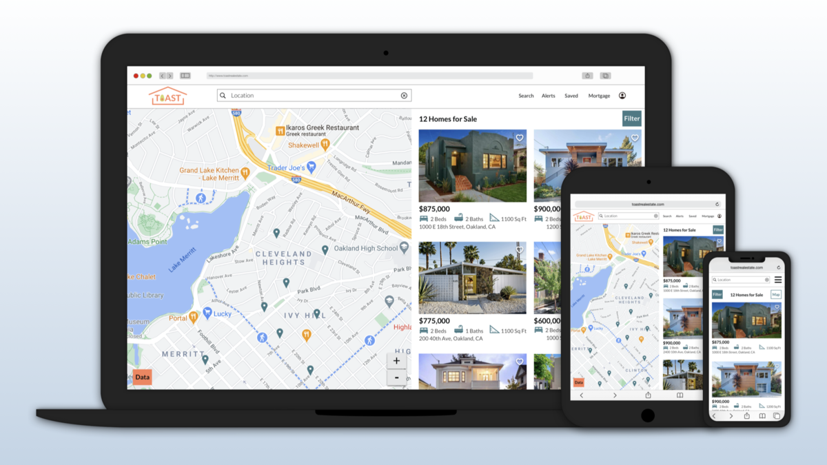
Main Takeaways
We began by researching the competition and developing user personas and site maps that help guide a series of wireframes and prototypes. Based on our visual design concept, we created hi-fidelity mockups at a range of breakpoints. We designed a brand logo and icons and selected a color palette, typography and imagery that are included in the style guide. We further refined the UI in through a series of animations and final mockups. The current product has been developed as a result of the UX/UI design process.
