About the Project
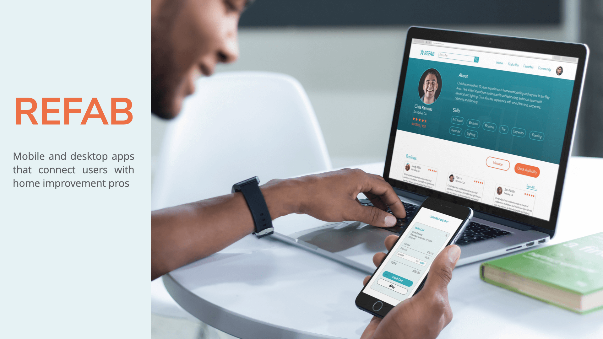
When tackling home improvement projects, getting useful advice and finding a qualified professional can be a challenge. While there are a number of apps that connect users with home improvement professionals, they don’t offer the option to schedule video chat sessions. Our users need a way to connect with pros in real time. There’s an opportunity to create a niche for our product connecting users with home improvement pros using video chat. I was responsible for end to end UX design including:
Research
Design
Testing
Tools used: Lucid Chart, Optimal Sort, Usability Hub, Sketch, Invision
Competitive Analysis
We reviewed our competitors to get a better idea of what’s out there and understand how Refab compares.
Patch

Patch brands itself as “the #1 home maintenance and repair app that uses video chat to instantly connect homeowners with expert handymen.”
- USABILITY: simplicity of the overall design makes Patch visually appealing and easy to use.
- LAYOUT: minimal design, including only the information needed
- NAVIGATION: bottom navigation bar provides access to ‘my account’ and ‘subscribe’; home page option to browse experts
- COMPATIBILITY: iOS and Android, no desktop app
- CALLS TO ACTION: after signing up, users are prompted to register for subscription
Handy
Handy brands itself as “the easiest way to book top-rated home cleaners and handymen.”
- USABILITY: simplicity of the overall design makes Patch visually appealing and easy to use.
- LAYOUT: minimal design, including only the information needed
- NAVIGATION: bottom navigation bar provides access to ‘my account’ and ‘subscribe’; home page option to browse experts
- COMPATIBILITY: iOS and Android, no desktop app
- CALLS TO ACTION: after signing up, users are prompted to register for subscription
User Research & Analysis
To help better understand our users’ needs and pain points, we conducted interviews and surveys.
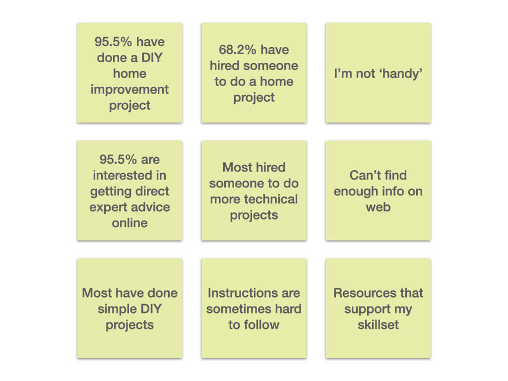
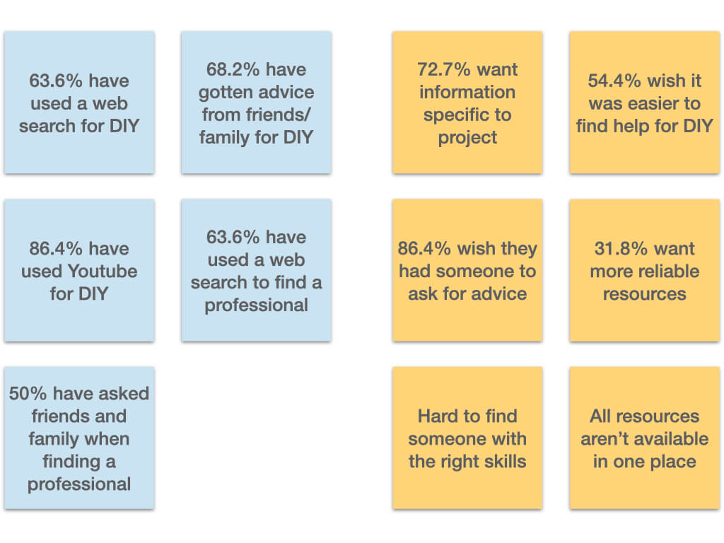
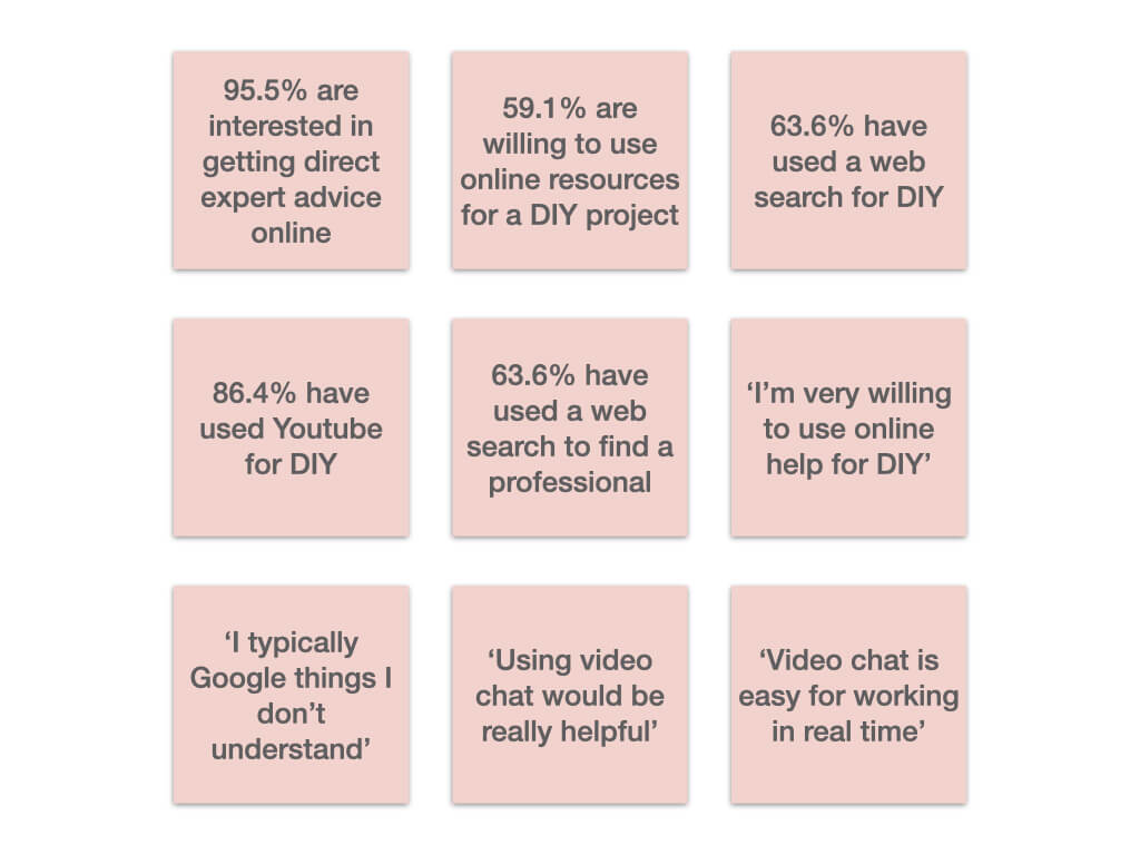
We conducted 22 surveys and 3 in-person interviews to to gather data. We used affinity mapping to analyze the information we gathered. We wanted to gain insight about three key points:
1. Users’ preferences for DIY vs. hiring someone for home improvement and repair projects.
2. Resources users currently use for DIY home projects and how those resources could be better.
3. User’s willingness to use online tools to supplement their skills for DIY home projects.
User Personas & Journeys
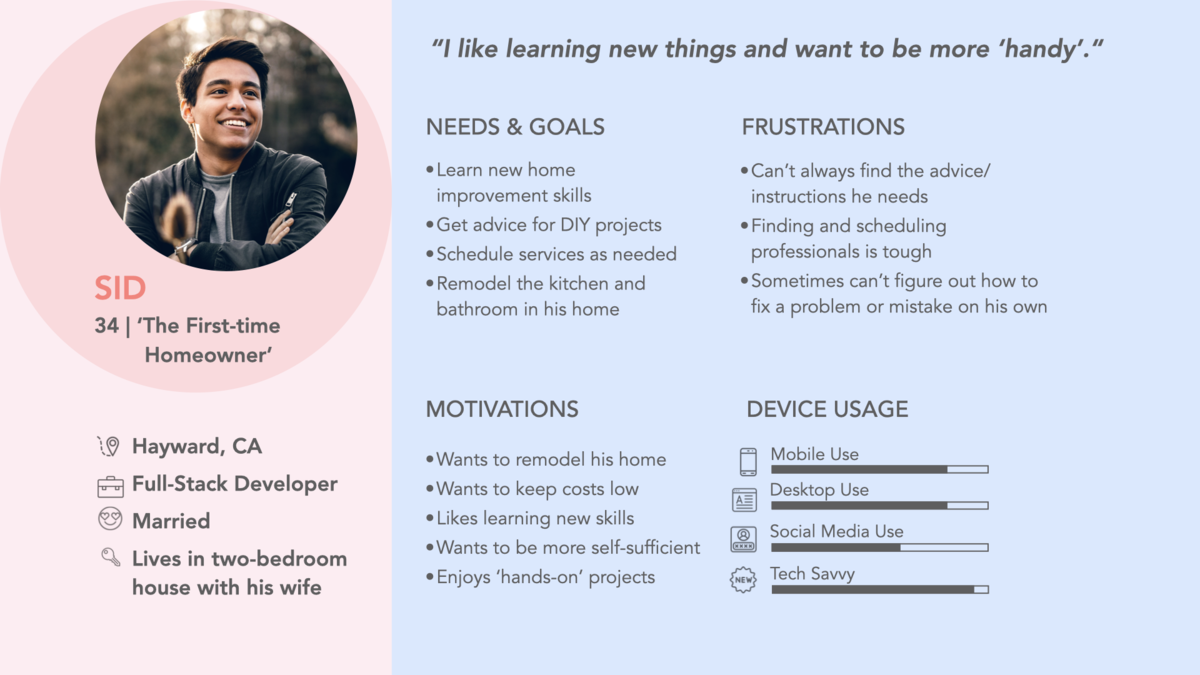
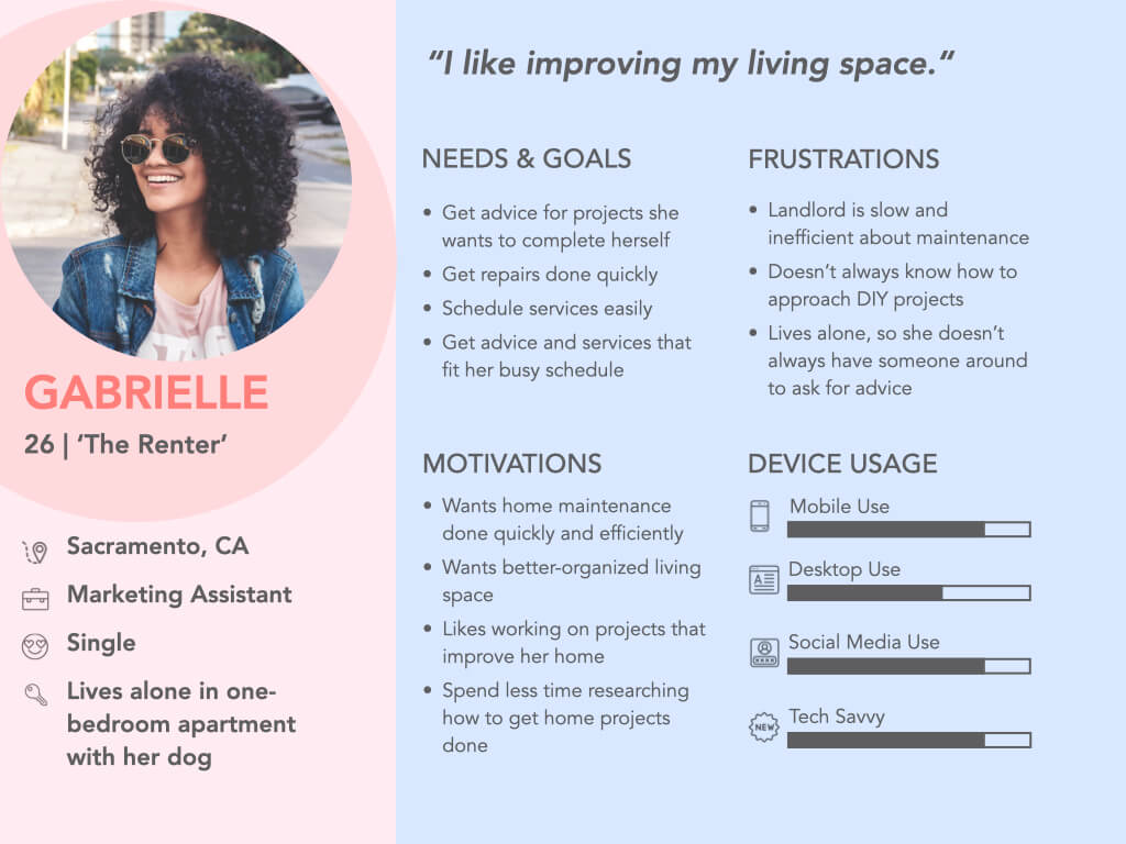
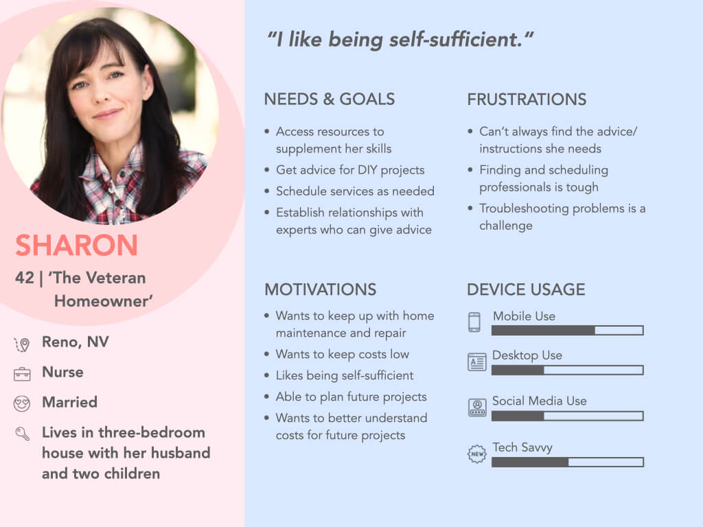
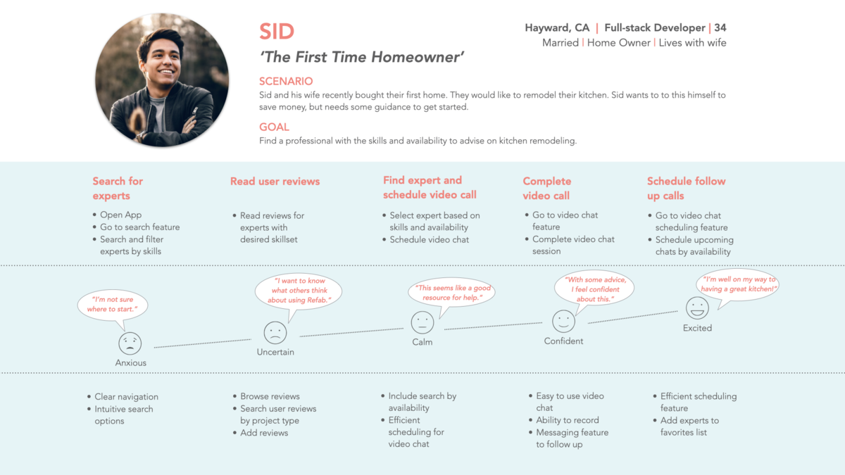
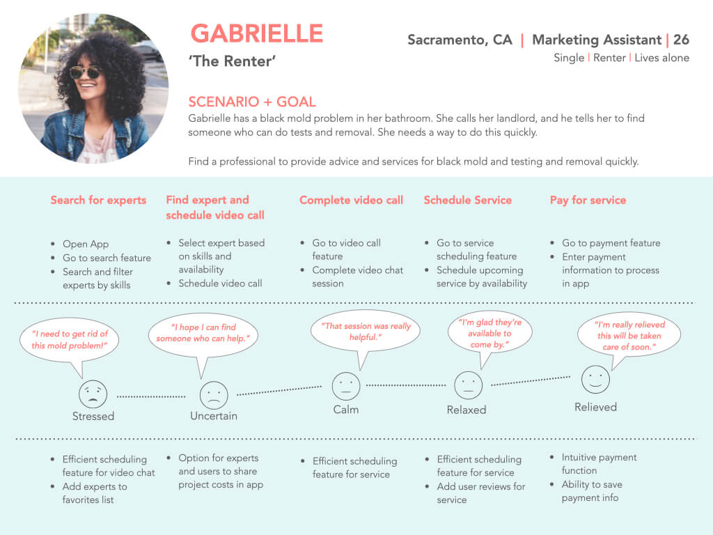
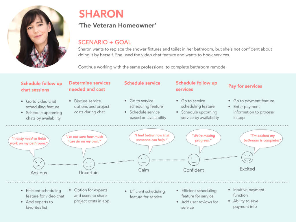
From our user research, we developed user personas and user journeys aimed at addressing users’ needs.
Site Mapping & Card Sorting
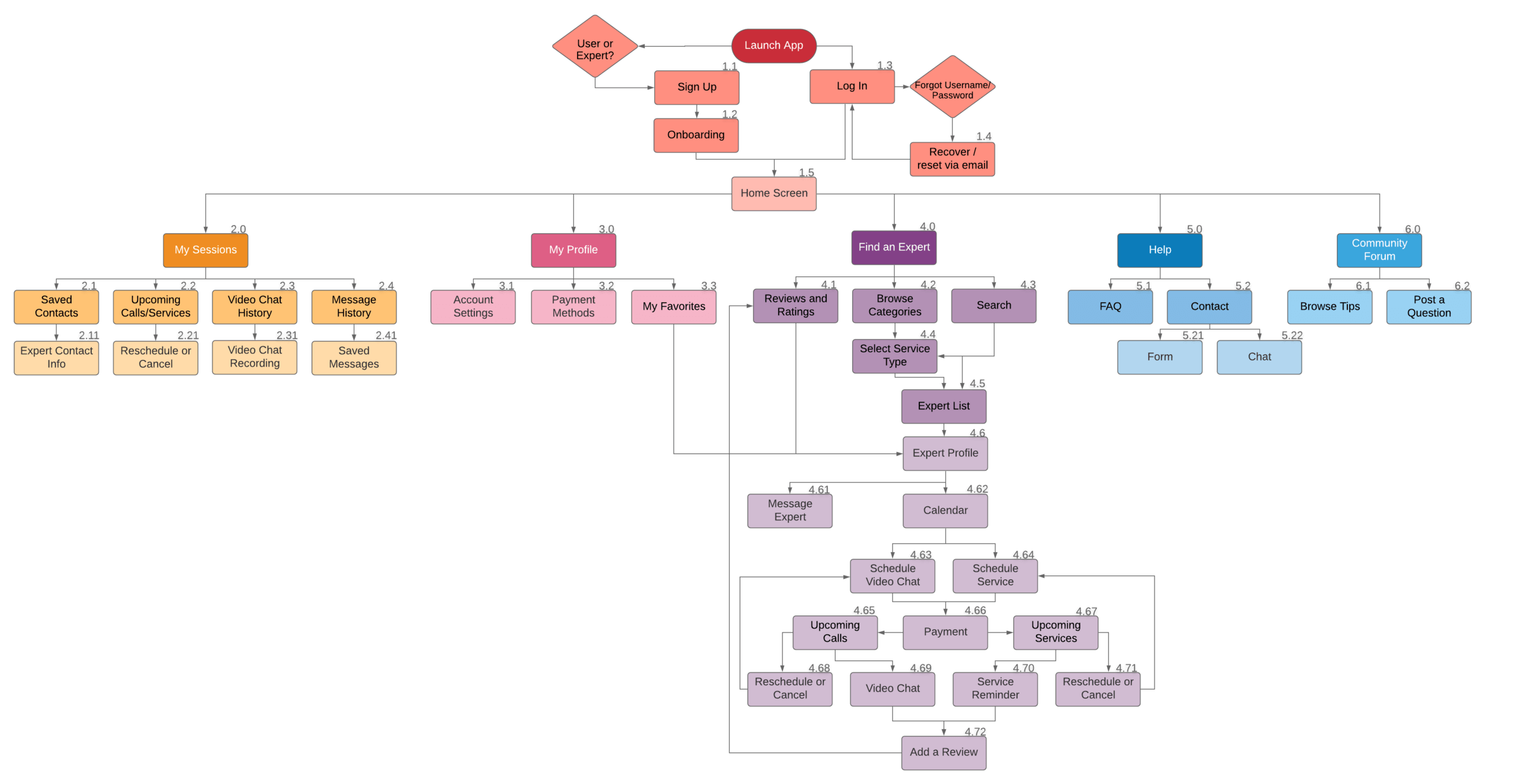
We used our user journeys to develop site maps that provide a ‘happy path’ for user to achieve their goals.
User Site Map
Card Sorting
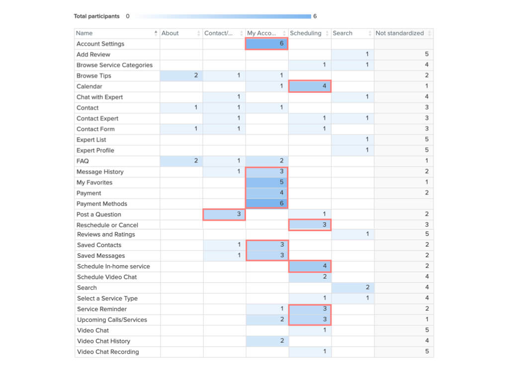
To verify the structure of our site map, we conducted an open card sort with 6 participants using OptimalSort. The test included 30 cards with content topics.
- 6 out of 6 users think ‘My Account/Profile’ should include ‘Account Settings’ and ‘Payment Methods’
- 5 out of 6 users think ‘My Favorites’ should be included under ‘My Account/Profile’
- Several participants created a separate category for scheduling
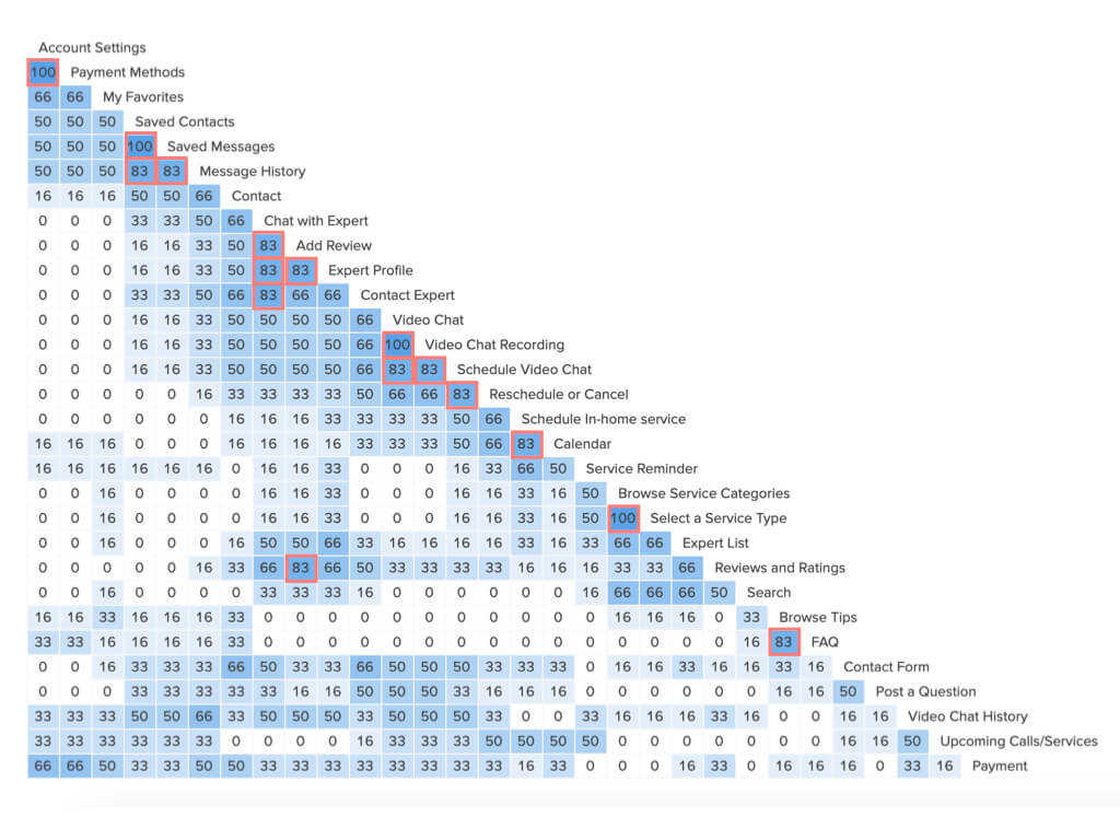
- ‘Message History’, ‘Saved Messages’, ‘Saved Contacts’ frequently grouped
- Clear connection between ‘Chat with Expert’, ‘Add Review’, ‘Expert Profile’, ‘Contact Expert’
- Browse Service Categories’ and ‘Select a Service Type’ are always listed in the same category
Wireframes & Prototypes
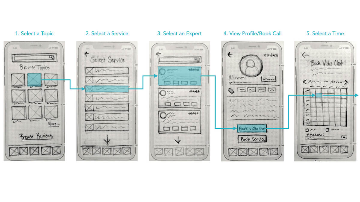
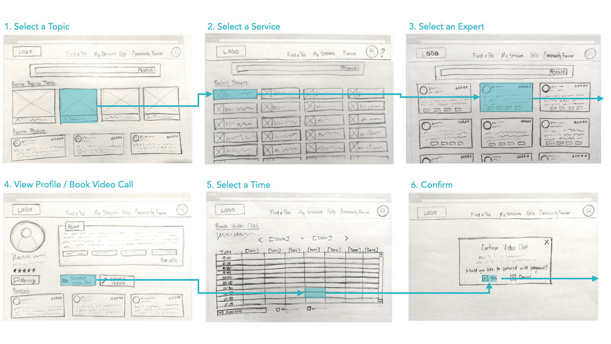
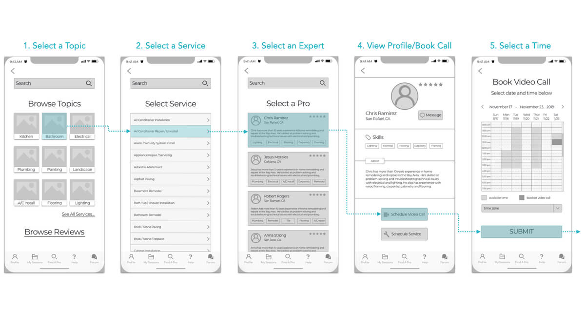
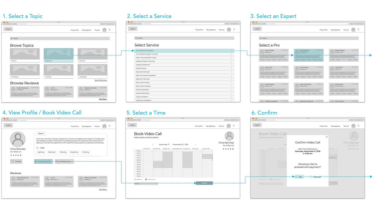
We used our site map to begin developing wireframes and prototypes.
Lo-fidelity wireframes: Mobile
Tools: paper & pencil, Keynote
Lo-fidelity wireframes: Desktop
Mid-fidelity wireframes: Mobile
Tools: Sketch, Keynote
Mid-fidelity wireframes: Desktop
Hi fidelity mockups: Mobile
Tools used: Sketch, Invision
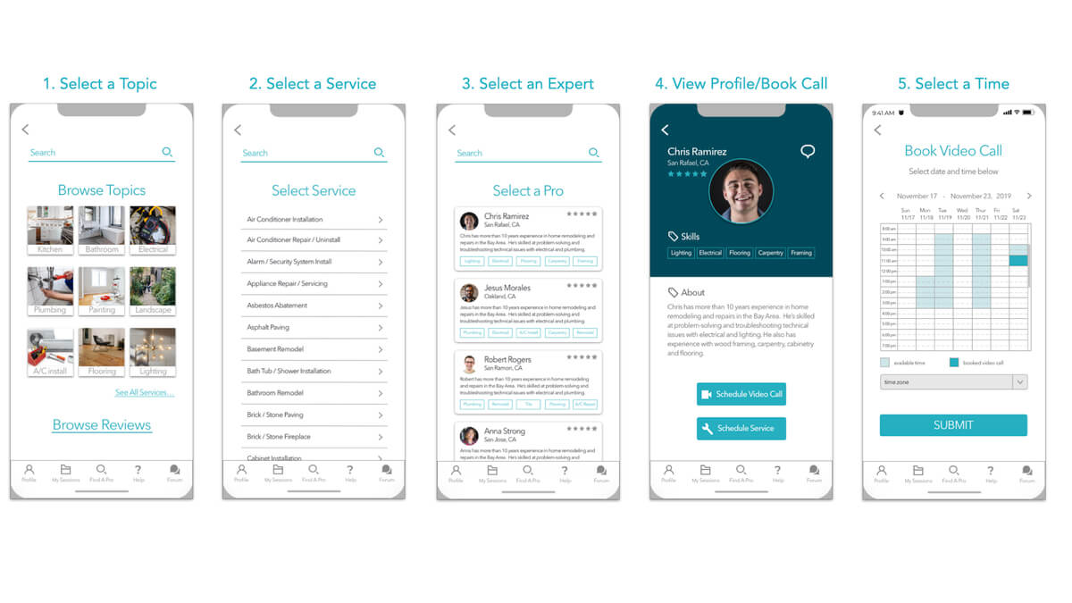
Hi fidelity mockups: Desktop
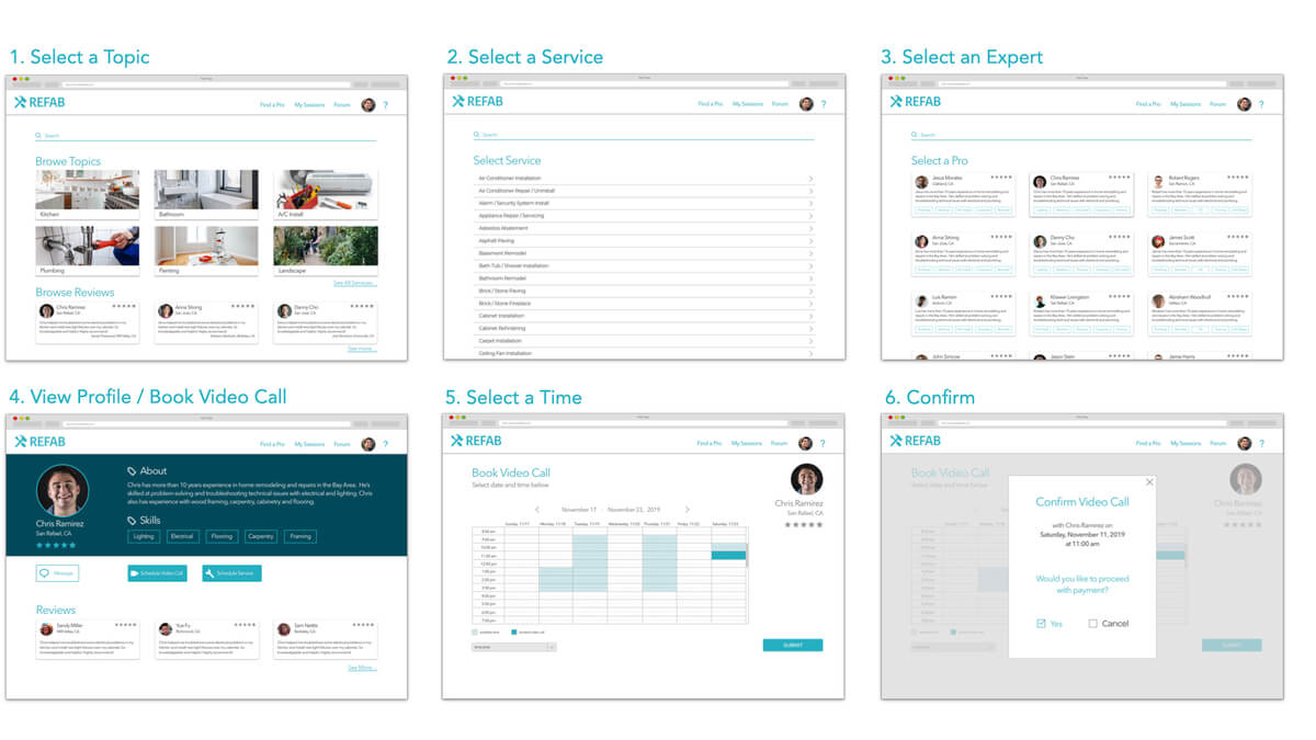
Usability Testing
Once we developed hi fidelity prototypes, we began user testing to check where we may need to improve.
Usability Test objectives:
- Determine if users understand the purpose and value of the app quickly
- Observe how users sign up/sign in
- Observe how users schedule a video chat call or a service
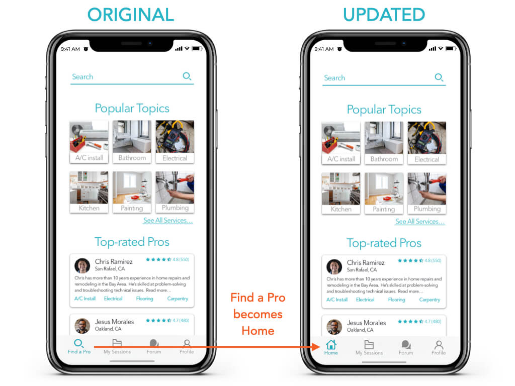
“The find a pro link at the bottom is confusing. It’s really the home page.”
“The options to schedule a call or a service need more hierarchy.”
“Where do I go to see reviews?”
Issue #1: High Severity
Find a Pro Link is confusing. Where's the home page?
Suggested Change:
Change label and icon from Find a Pro to Home
Issue #2: High Severity
Unsure how to schedule a call or service.
Suggested Change:
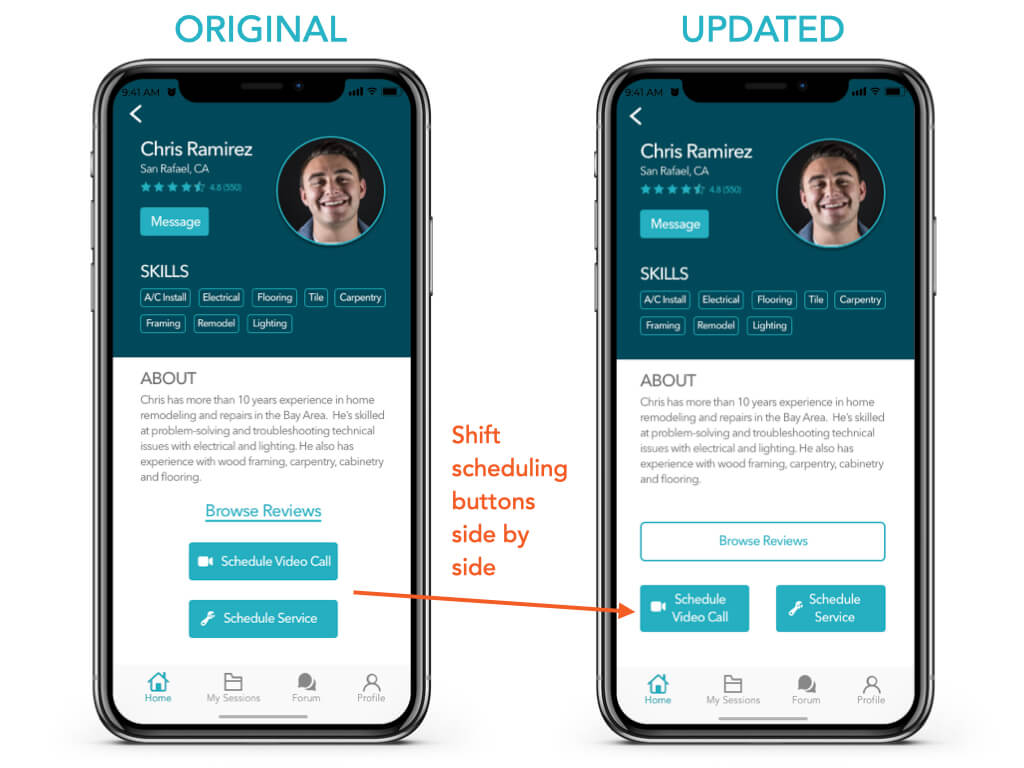
Shift scheduling buttons side by side
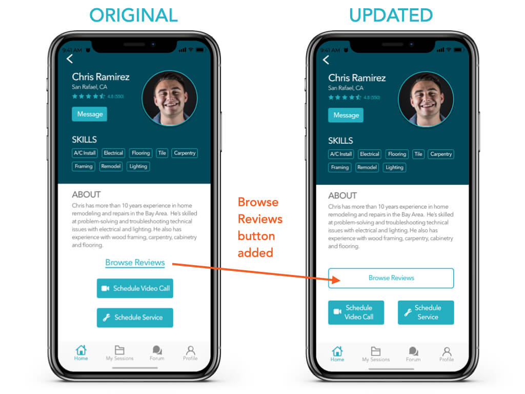
Issue #3: Moderate Severity
Missed the link to browse reviews from profile screen
Suggested Change:
Make reviews link stand out more with a button
Issue #4: Low Severity
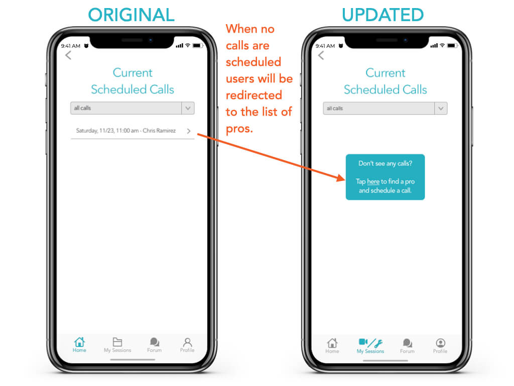
When there are no calls, what's the purpose of this screen?
Suggested Change:
Add a pop up. Scheduled sessions will only appear after booking
Preference Testing
We conducted preference tests to gauge users’ interest in different options for the login screen on mobile and the home screen on desktop.
We conducted a preference test using Usability Hub. A total of 18 participants completed the test.
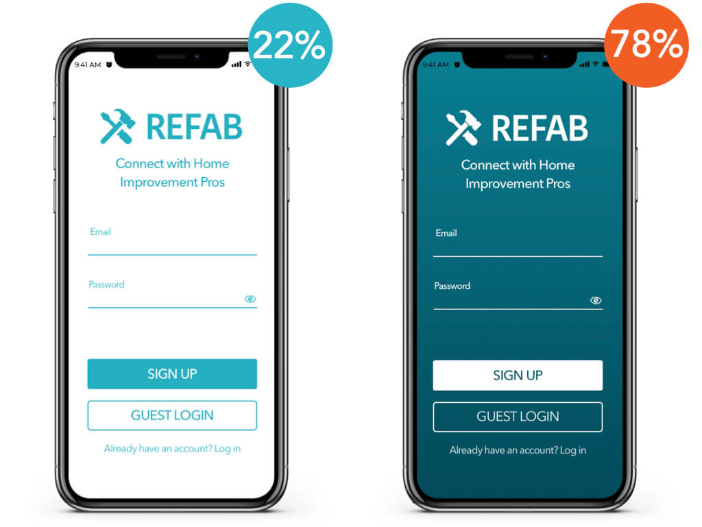
Preference Test #1
Focus on UI color and contrast and user engagement
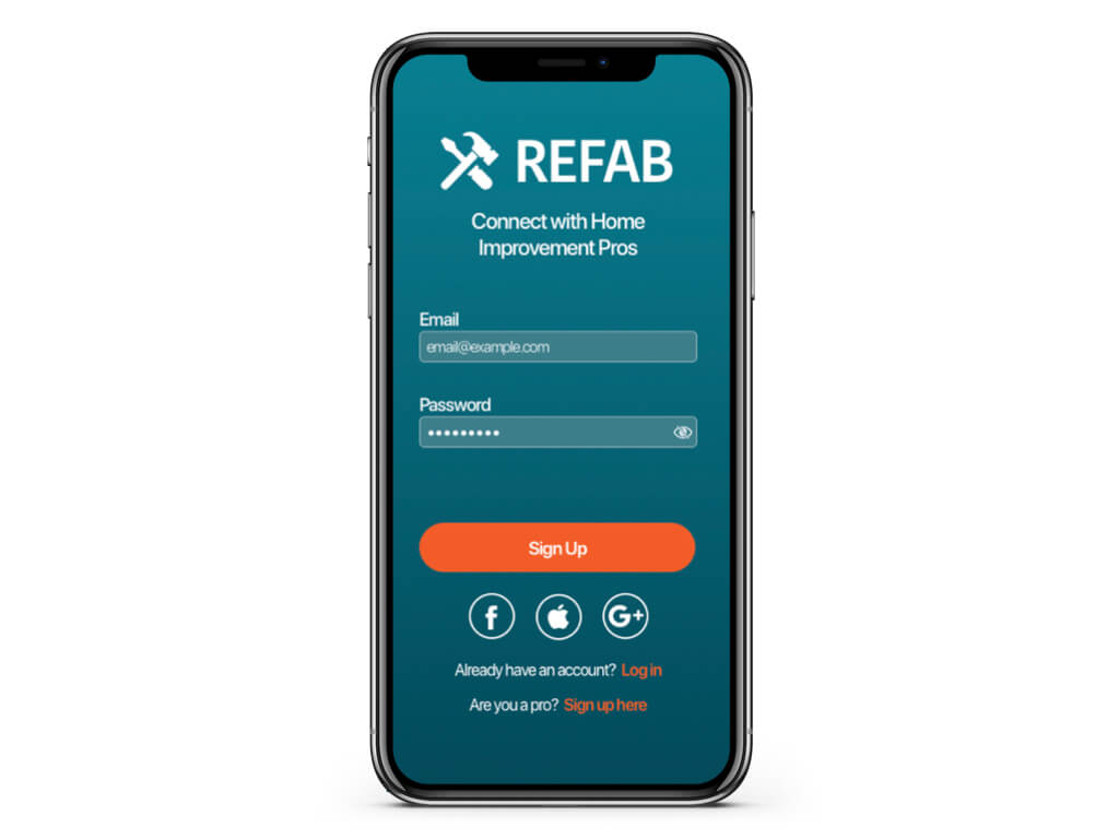
Conclusion: A majority of participants preferred the darker screen. Participants said they the darker screen looks less like every other app.
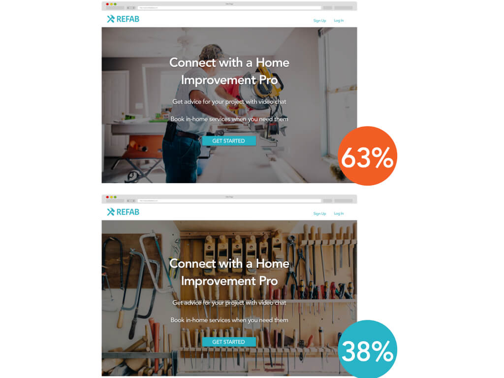
Preference Test #2
Focus on UI color and contrast and user engagement
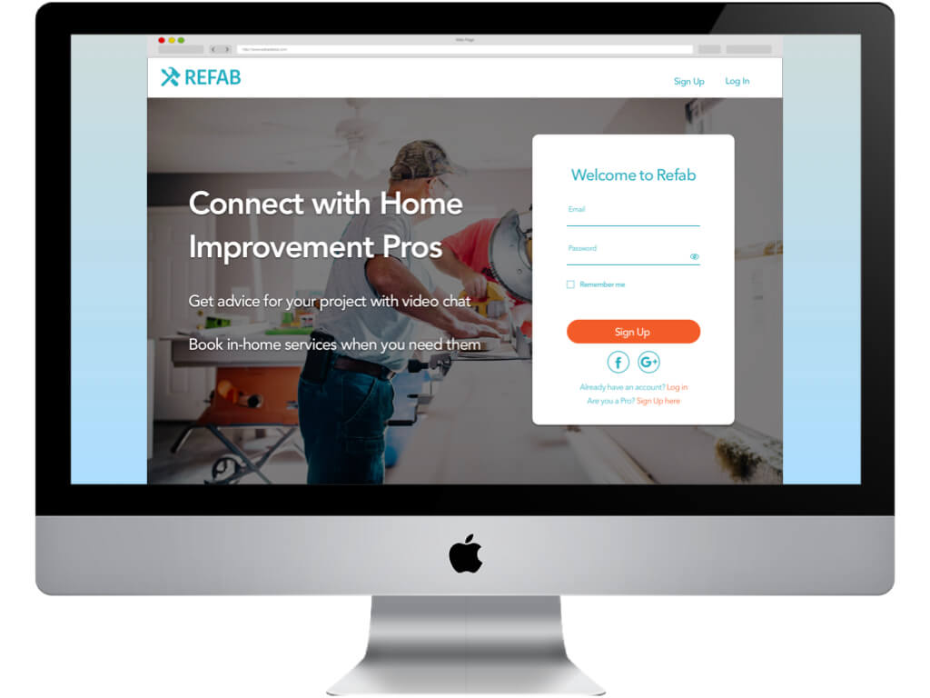
Conclusion: A majority of participants preferred the first option. Participants said they like seeing people in the image and it seems more active.
UI Style Guide & Design Language
After updating our prototypes based on user testing, we refined the UI and developed a style guide, pattern library, and design language.
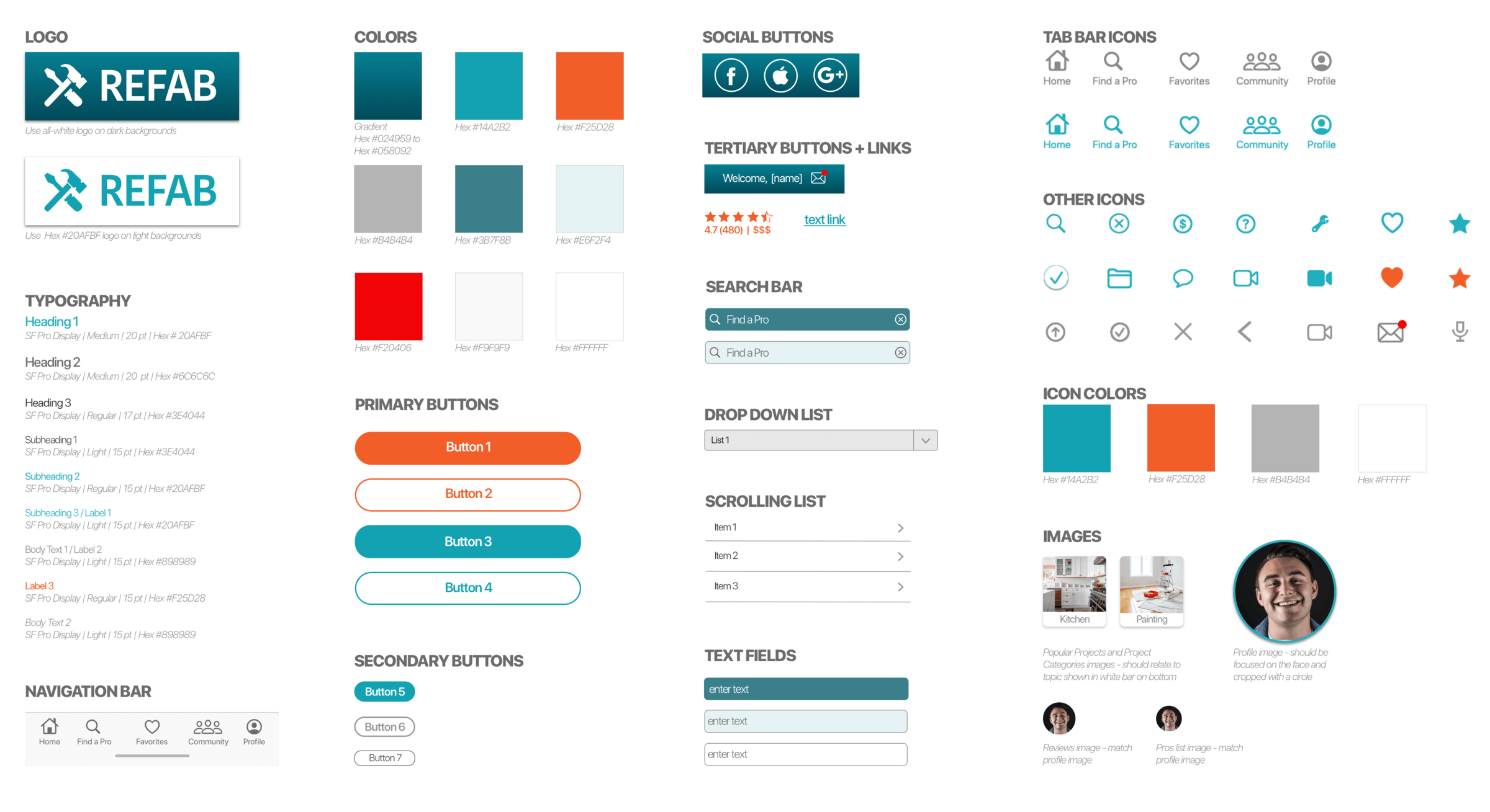
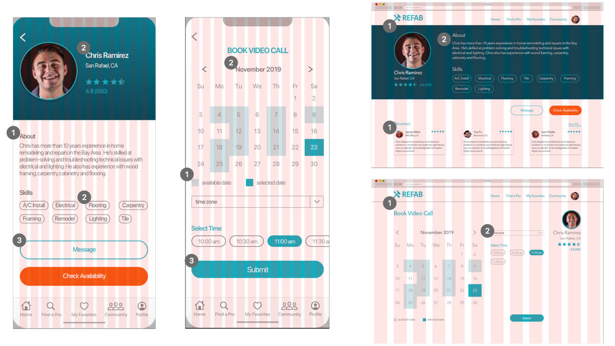
12 Column Grid
Mobile: Column width 20 px; Gutter width 9 px
Desktop: Column width 35 px; Gutter width 15 px
- Align all left-justified elements with edge of the far left column
- Align text, icons and images with edges of columns where possible
- Stretch full-size buttons and text to edges of outermost columns
Accessibility Review
Then we checked the accessibility and made a further refinements to make sure our product works for everyone.
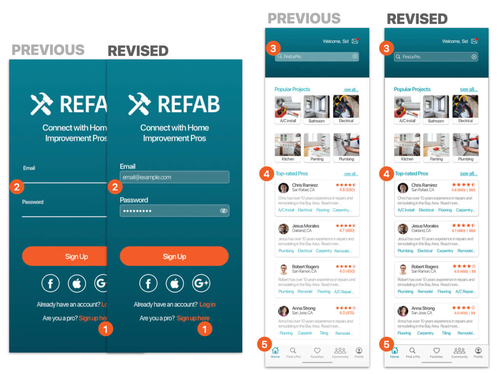
- TEXT CONTRAST: Bold font
- FORM FIELDS: Replaced text fields with form fields
- TEXT CONTRAST: Darkened form field background
- TEXT CONTRAST: Darkened primary blue. Larger bold font where needed
- CONTRAST: Darkened icons and text on bottom navigation bar
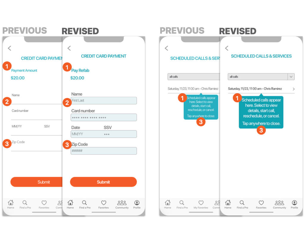
- CONTRAST: Darkened icons and text on bottom navigation bar
- FORM FIELDS: Replaced text fields with form fields
- TEXT CONTRAST: Larger, darker text where needed
Main Takeaways
We began by defining the problem and grounding our ideas in user research. We developed user personas, user journeys, and site maps that help guide a series of wireframes and prototypes. We used these initial prototypes to conduct user testing. We analyzed our results and defined ways to improve the product. We refined the UI, with a focus on accessibility. The current product has been developed as a result of an end-to-end UX design process.
